
Popovers
Popups that feel like part of the store.
Build offers, signups and info panels with the same blocks as your pages. Open them from a button, after a few seconds or partway down the page.
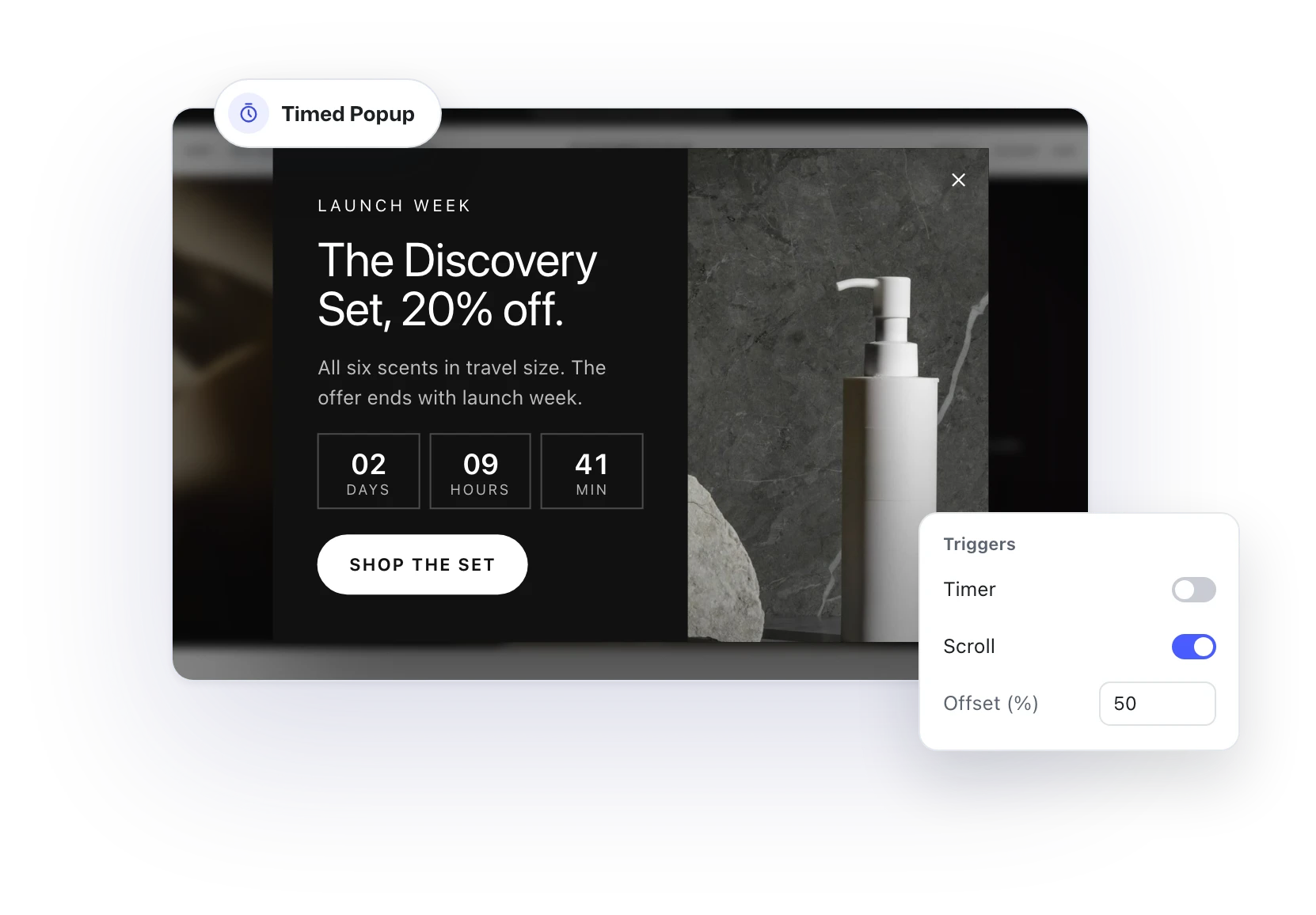
Offers and launches
Put the offer in the spotlight.
Start from the Timed Popup variation and build the offer with any blocks: a product photo, a countdown, a button to the collection. Show it after a few seconds, or once visitors are halfway down the page.
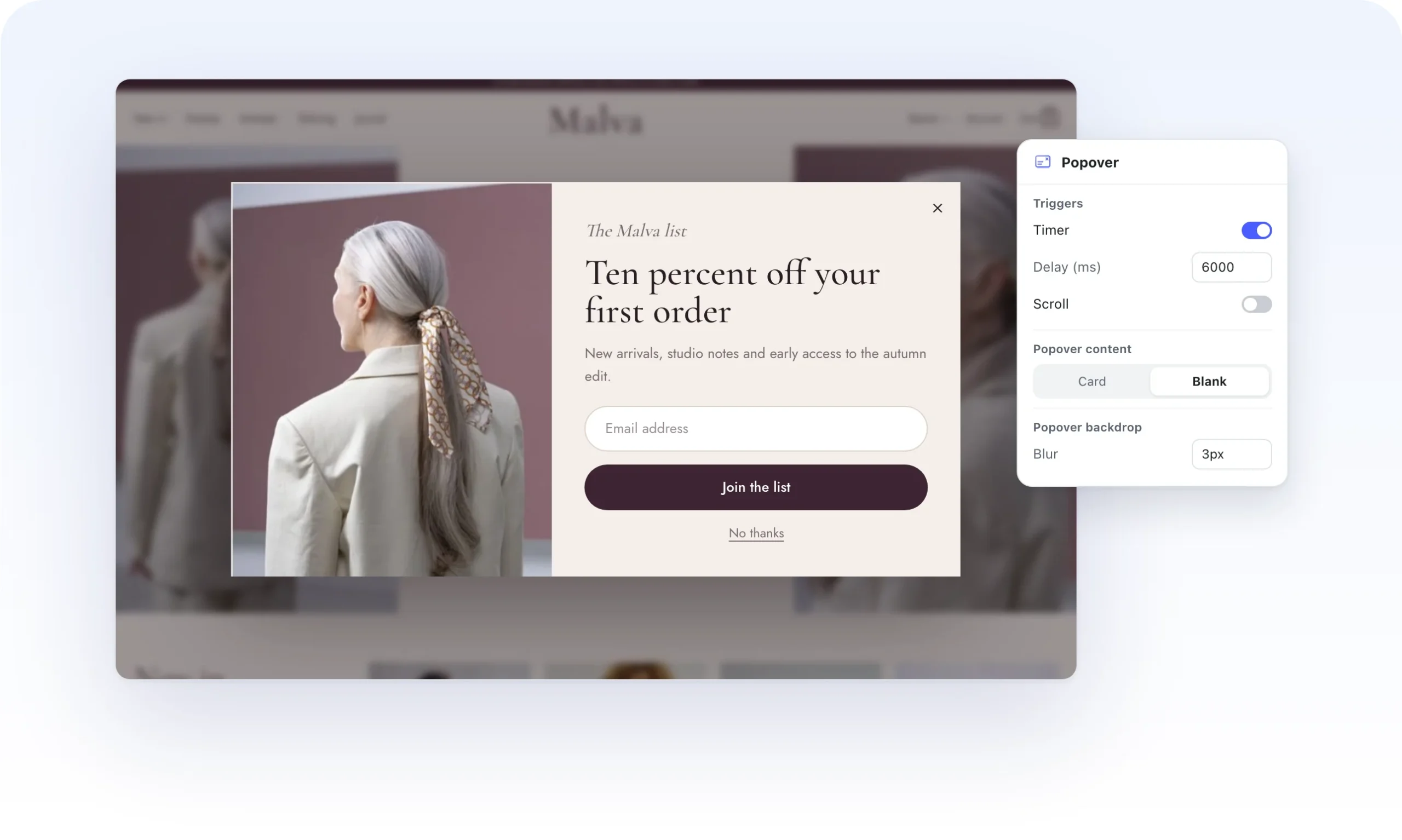
Email signups
Give shoppers a reason to come back.
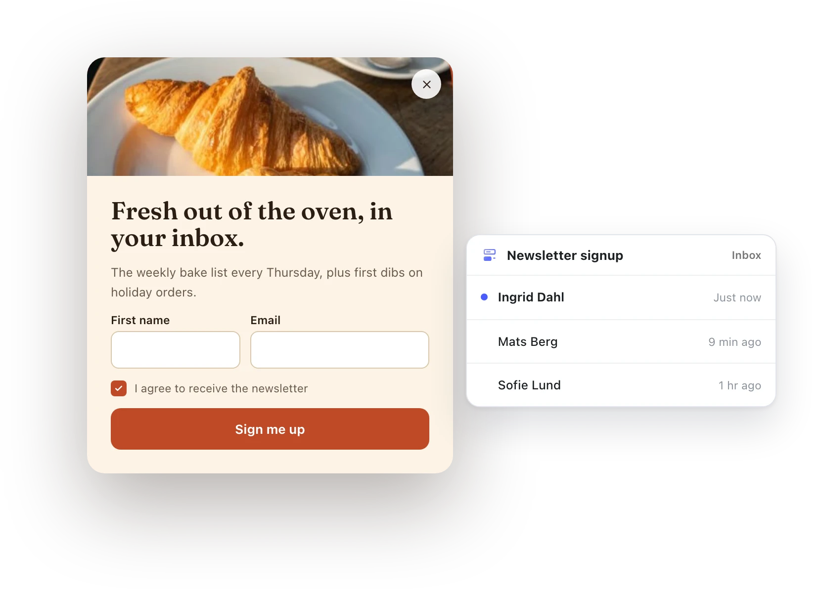
Put a Flatsome form inside a popover and grow your list with the fields you need, from name and email to a consent checkbox. Every signup lands in the Forms inbox, ready to export.
Polite by default
Shows up once, not every visit.
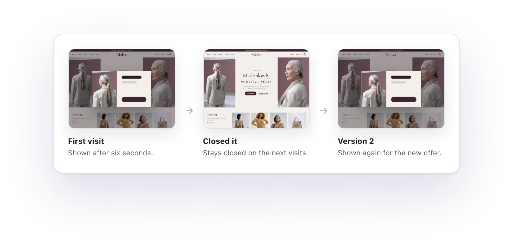
A timed popover remembers when a visitor closes it and stays closed on their next visits. When you have something new to say, change its version and it shows again. Only one triggered popover opens at a time, so nobody gets a stack of them.
One family
The same panel behind your header.
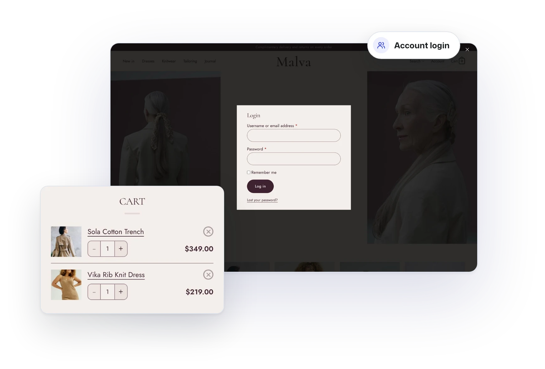
The account login, the cart drawer and the mobile menu are popovers too. They share the same backdrop, close button and style controls, so every panel on your site feels like it belongs together.
Every detail
Built to fit your design.
Every part of a popover follows your Global Styles, and every part can be changed.
Open it your way
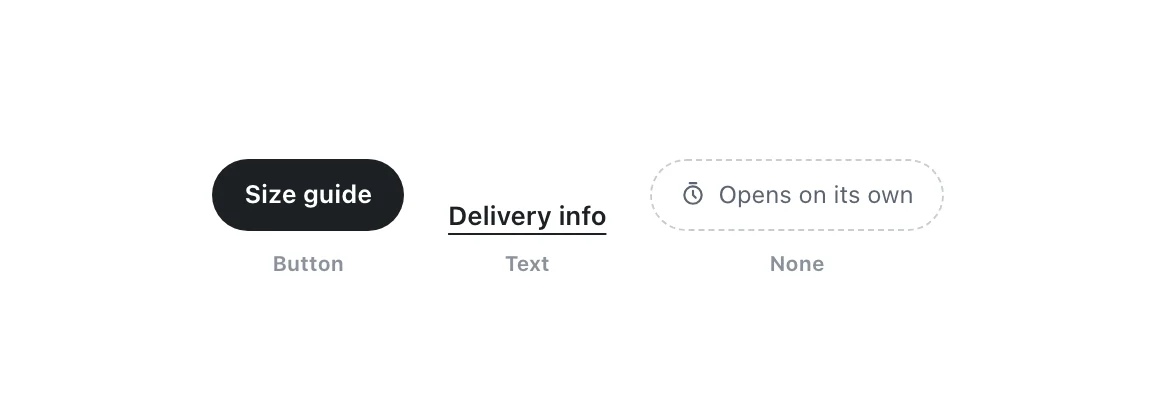
From a button, a text link, or on its own with a timer or scroll trigger.
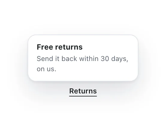
Info and Menu
Variations for a quick note or a small menu.
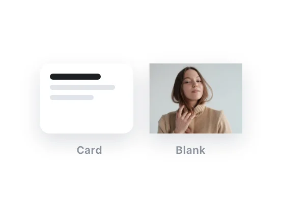
Card or blank
A ready card, or a blank canvas for full designs.
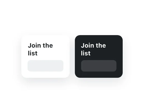
Light or dark
Each popover picks its own color scheme.
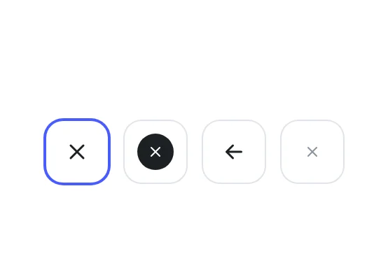
Close button
Choose the icon, size and color.

Backdrop
Set the color behind the popover and how much the page blurs.
Build the rest of the site the same way.
Popovers use the same blocks, styles and canvas as everything else in Flatsome.
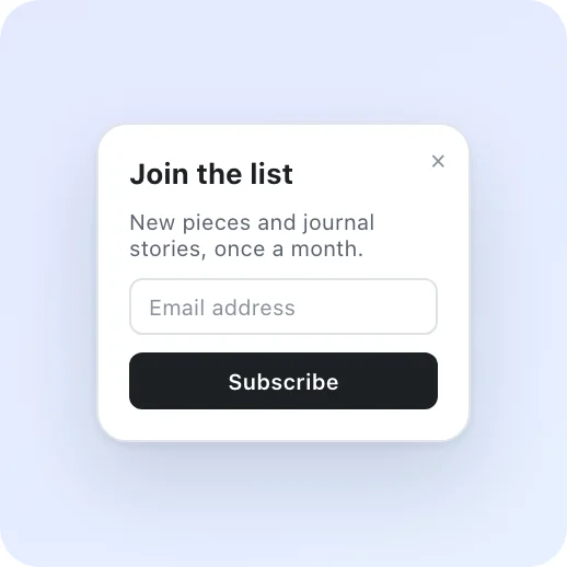

Forms and popups
Contact, booking and newsletter forms without code.
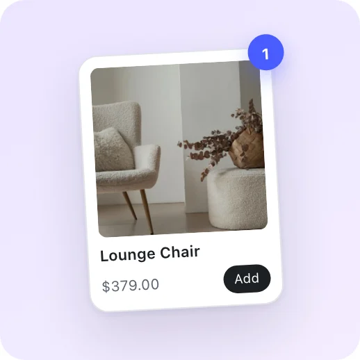

WooCommerce
Product pages, shop layouts, cart and checkout.
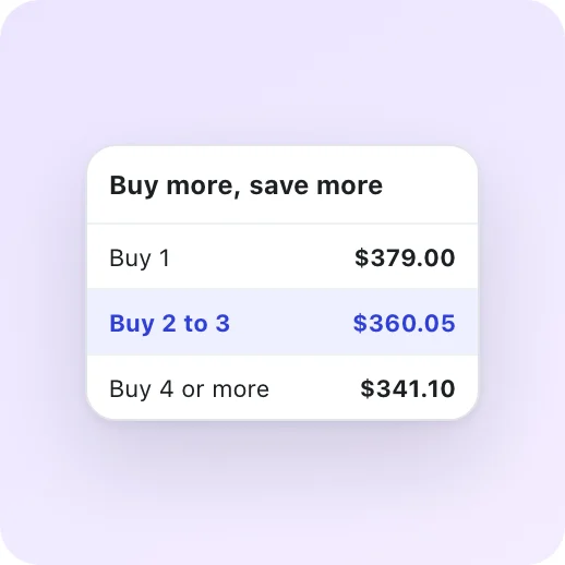

Dynamic Pricing
Sales, quantity breaks and buy X get Y deals.
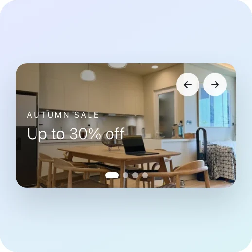
Sliders and banners
Campaign banners and slides for every launch.
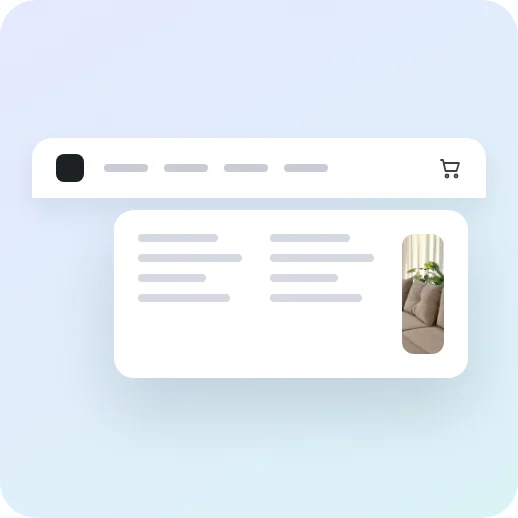
Headers and menus
Custom headers and accessible mega menus.
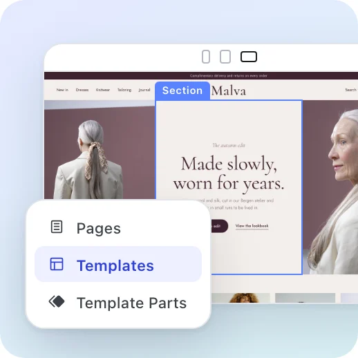
Site Builder
Pages, headers, footers and templates on one live canvas.
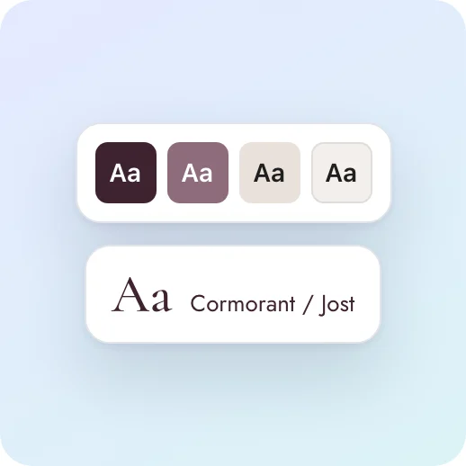

Global Styles
Colors, fonts and spacing that every block follows.
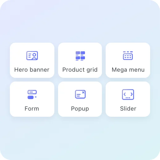

Flatsome Blocks
Over 100 responsive blocks for every section.

Give every offer its moment.
Popovers are part of every license. Build them on the live canvas with the blocks you already use.
Classic customers go first. 50% off your first year until November 2.