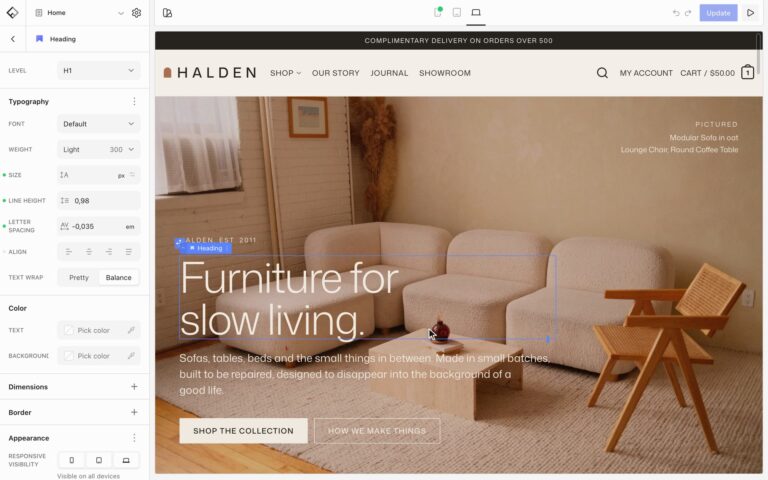

Sliders and banners
Sliders and banners, ready for every launch.
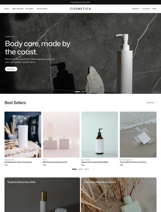
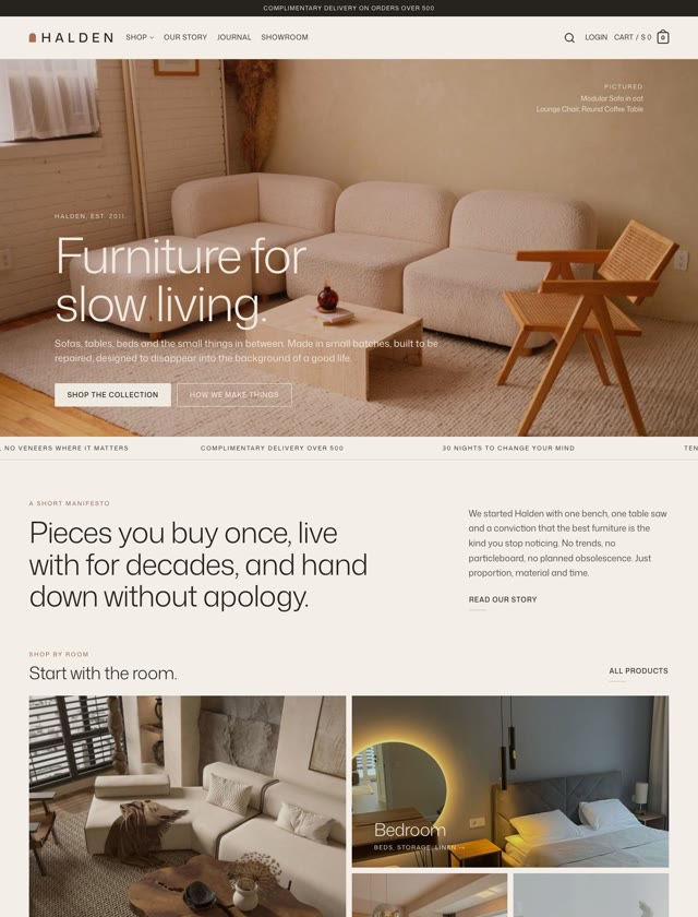
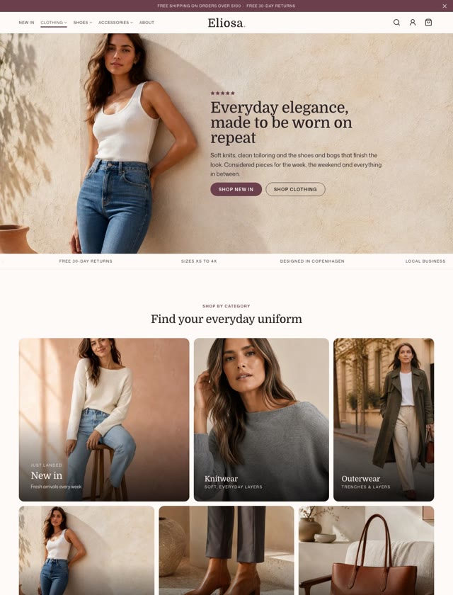
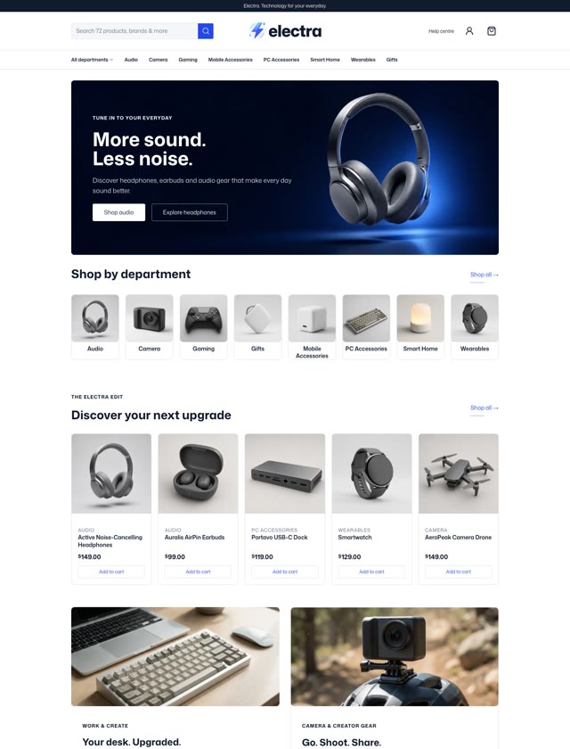
Build hero sliders, campaign banners and collection grids with the same blocks and styles as the rest of your store.
Sliders
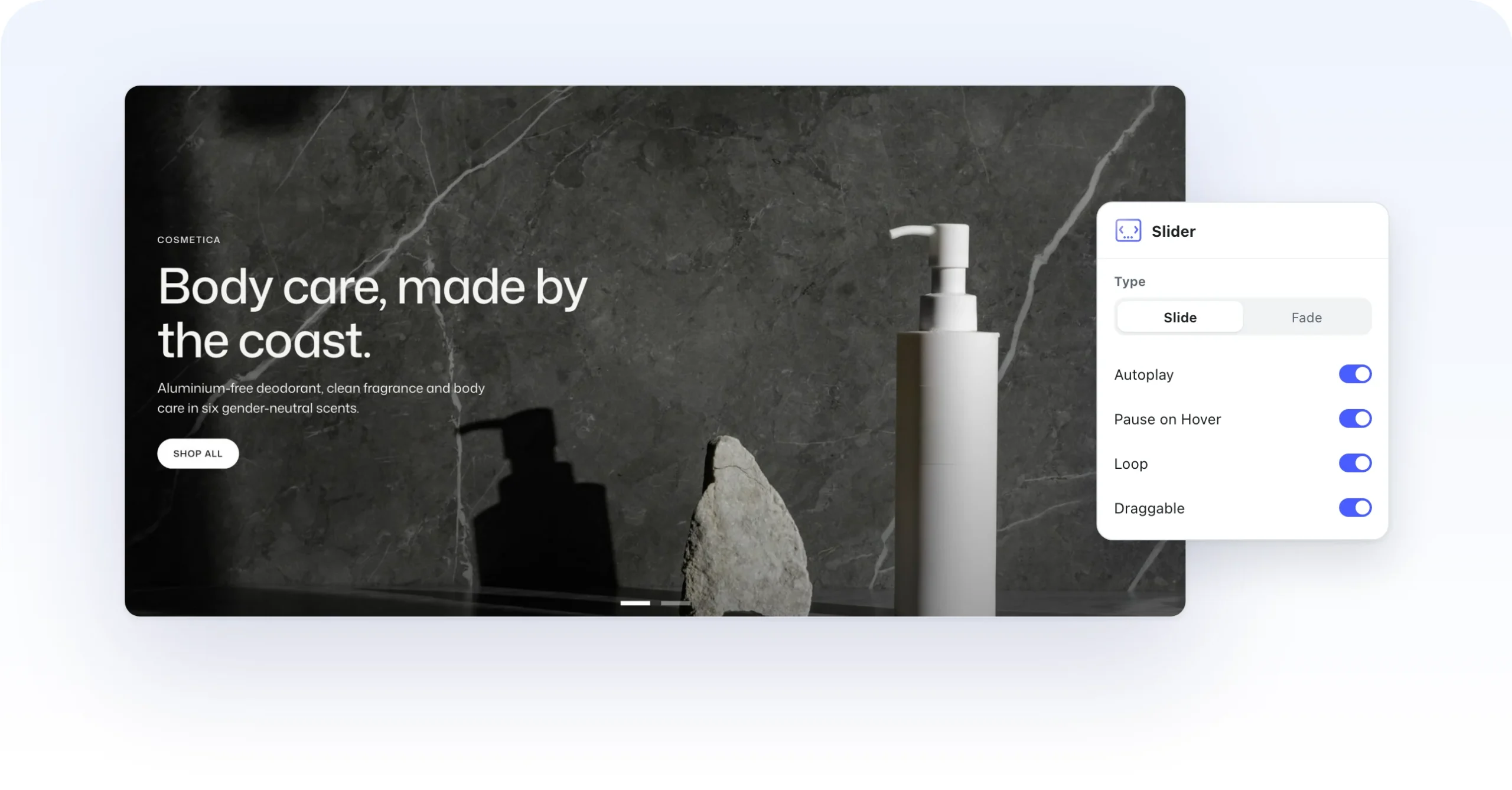
A slide for every story.
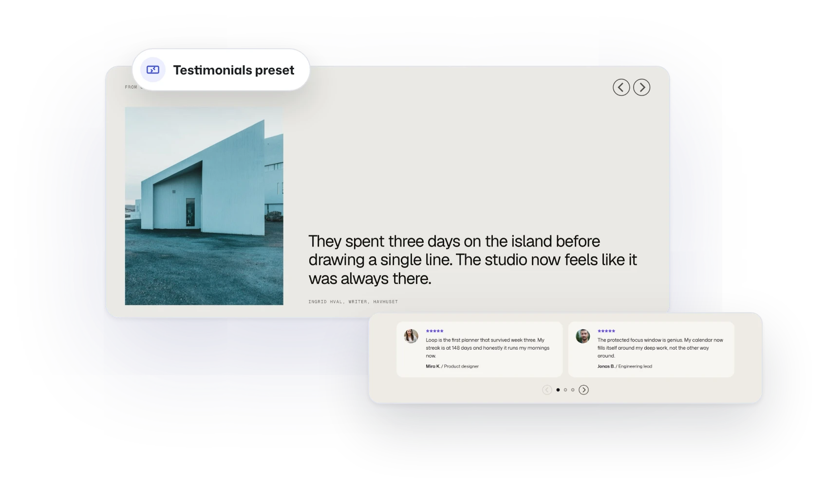
Start a Slider from the Hero Banners, Image Carousel or Testimonials preset and fill each slide with any blocks. Slide or fade between them, show one at a time or a row of cards, and let visitors drag or swipe through.
Hotspots
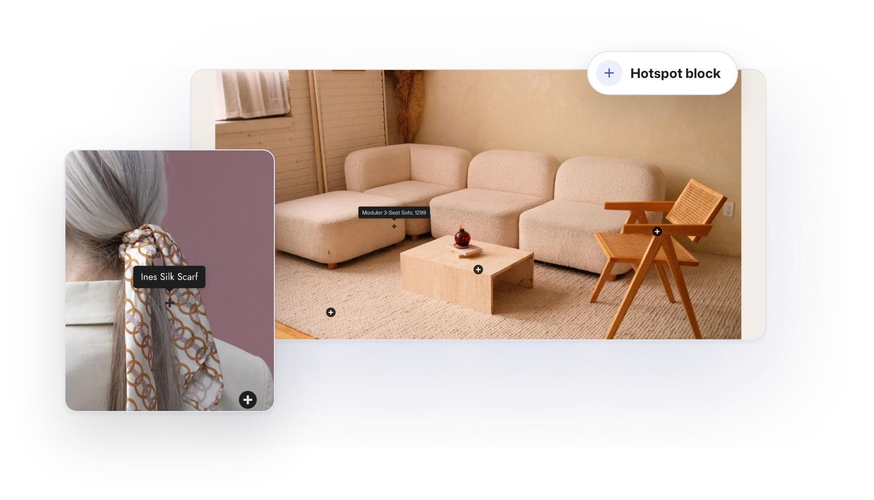
Shop straight from the photo.
Place Hotspots on any Banner to point at the pieces in the shot. Each one reveals a label, a link or a product on hover or tap, so a lookbook leads right to the product page.
Banner Grid
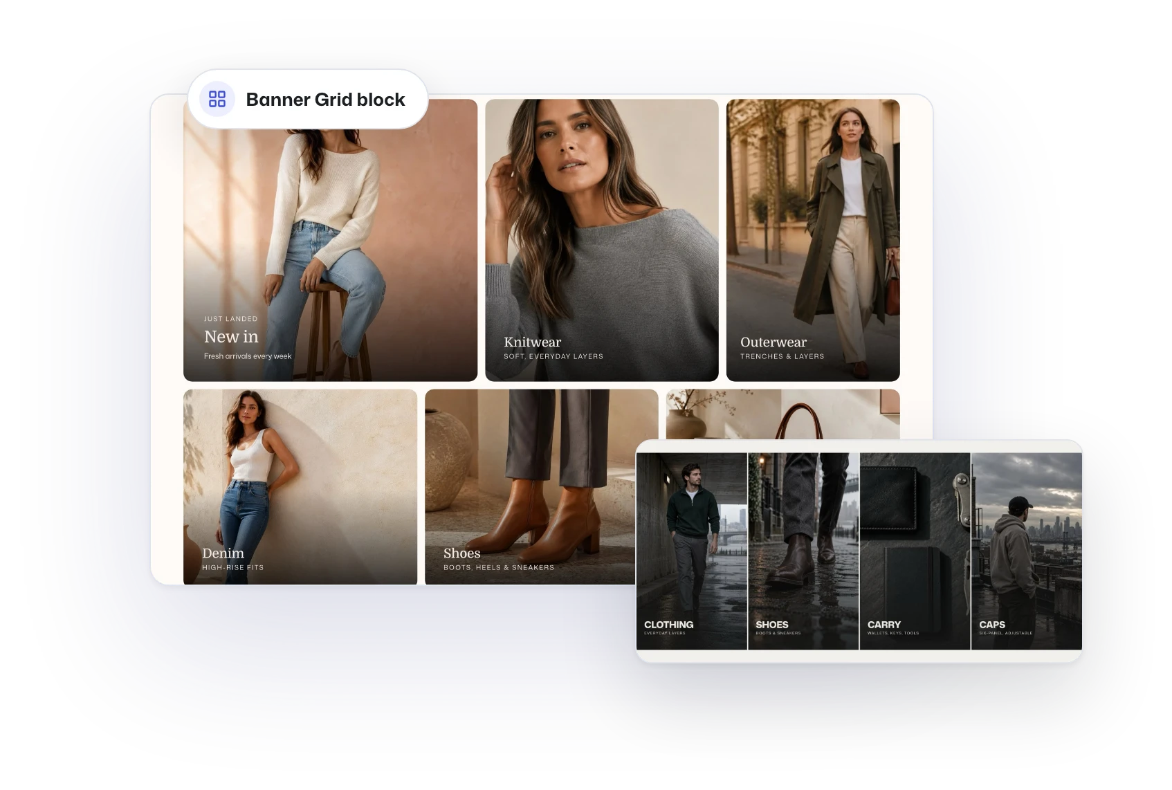
A front door for every collection.
Banner Grid lines up banners, images and sliders at one shared height. Give the new arrivals the big tile, add hover states that invite the click, or turn the whole grid into a slider.
Every detail
Everything a campaign needs.
Small blocks that turn a banner into a launch, all styled by your Global Styles.
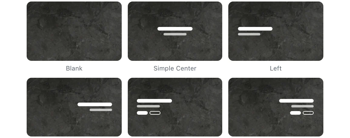
Banner layouts
Start from a centered, left or right layout, with or without buttons.
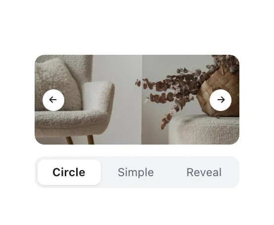
Slider buttons
Circle, simple or reveal, inside or outside the slides.
Dots
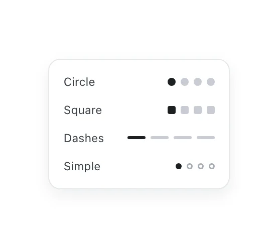
Circles, squares, dashes or simple dots, always or on hover.
Countdown
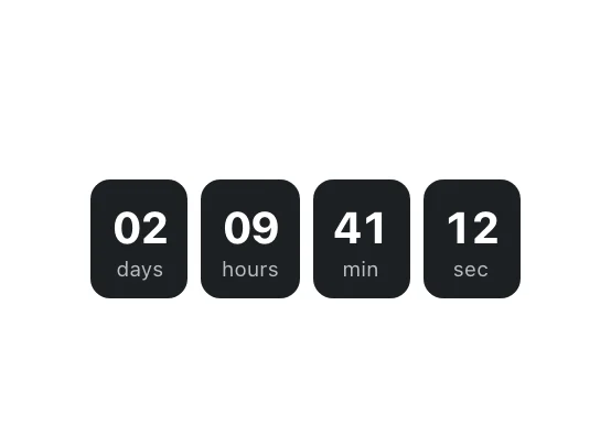
Count down to a launch or the end of a sale.
Video Button
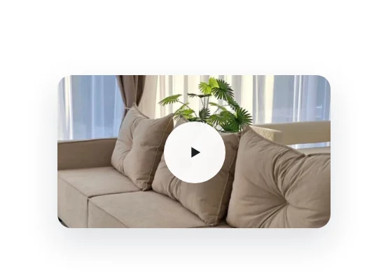
A play button that opens your video in a lightbox.
Marquee
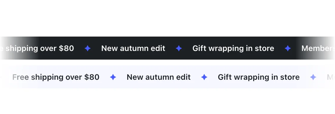
A scrolling ticker for offers, logos or press quotes, left or right, fast or slow.
Build the rest of the site the same way.
Sliders and banners use the same blocks, styles and canvas as everything else in Flatsome.
Site Builder
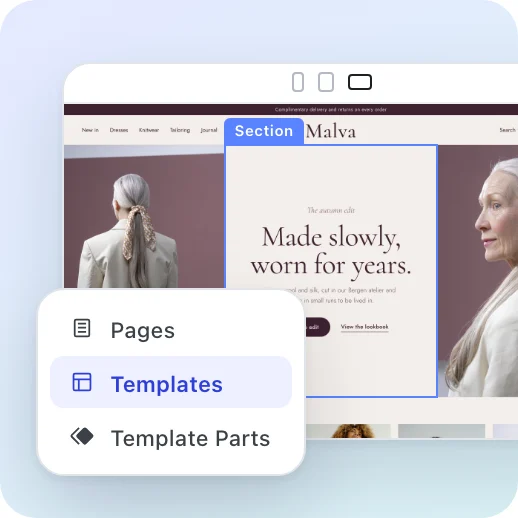
Pages, headers, footers and templates on one live canvas.

WooCommerce
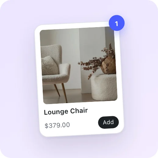
Product pages, shop layouts, cart and checkout.
Headers and menus
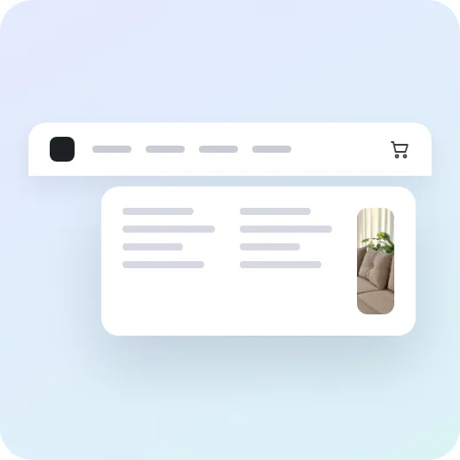
Custom headers and accessible mega menus.

Templates
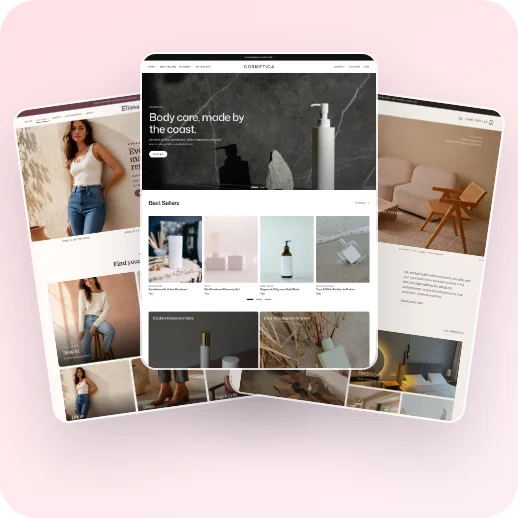
Start from a ready-made website and make it yours.
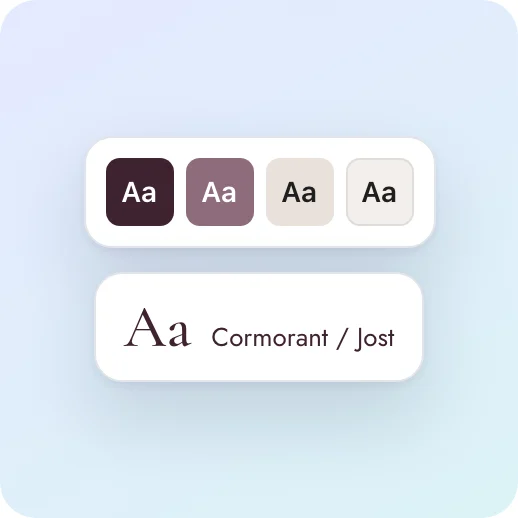

Global Styles
Colors, fonts and spacing that every block follows.
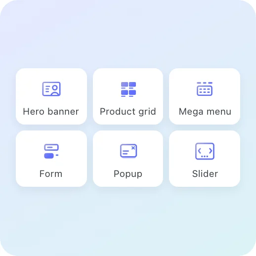

Flatsome Blocks
Over 100 responsive blocks for every section.
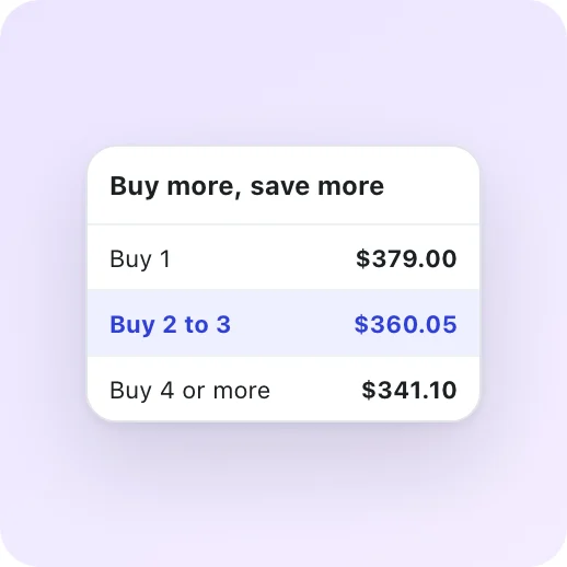

Dynamic Pricing
Sales, quantity breaks and buy X get Y deals.
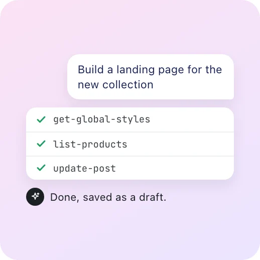

Flatsome MCP
Let your own AI agent build and edit with you.

Make your next launch hard to miss.
Sliders, banners and every campaign block are part of every license. Build them on the live canvas and publish when you are ready.
Classic customers go first. 50% off your first year until November 2.