





Banner
Make a strong first impression.
Put a great photo, a clear message and a button together. Build a hero for your homepage, a landing page or your next launch.
- Layer imagery and content with independently positioned text boxes.
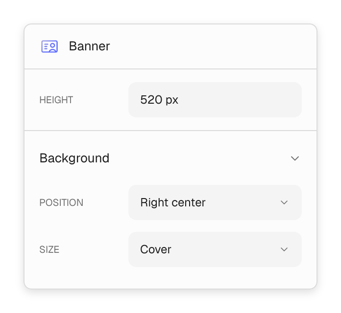
- Set the height, focal point and spacing for every screen.
- Reuse the same design anywhere on your site.
Slider
Show more in the same space.
Feature a new product, a service and your latest news in one slider. Build each slide from blocks, then let visitors swipe between them.
- Use arrows, dots and swipe navigation.
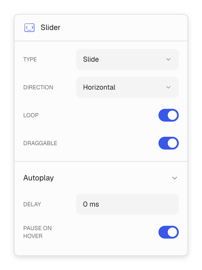
- Choose slide or fade transitions, autoplay and looping.
- Show one slide or several cards at once.


Section & Row
Give every page the right structure.
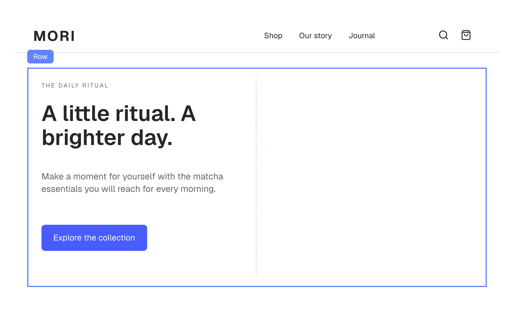
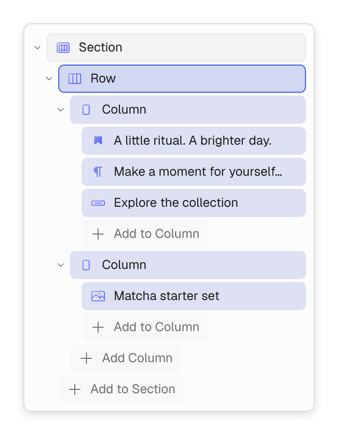
Start with a section, split it into columns and fill them with content. Build anything from a simple two-column layout to a full landing page.
- Nest blocks inside rows and columns.
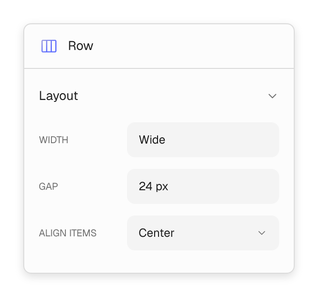
- Set gaps, alignment and responsive column widths.
- Combine headings, buttons, images and more.
Popover
Turn a visit into a reason to return.
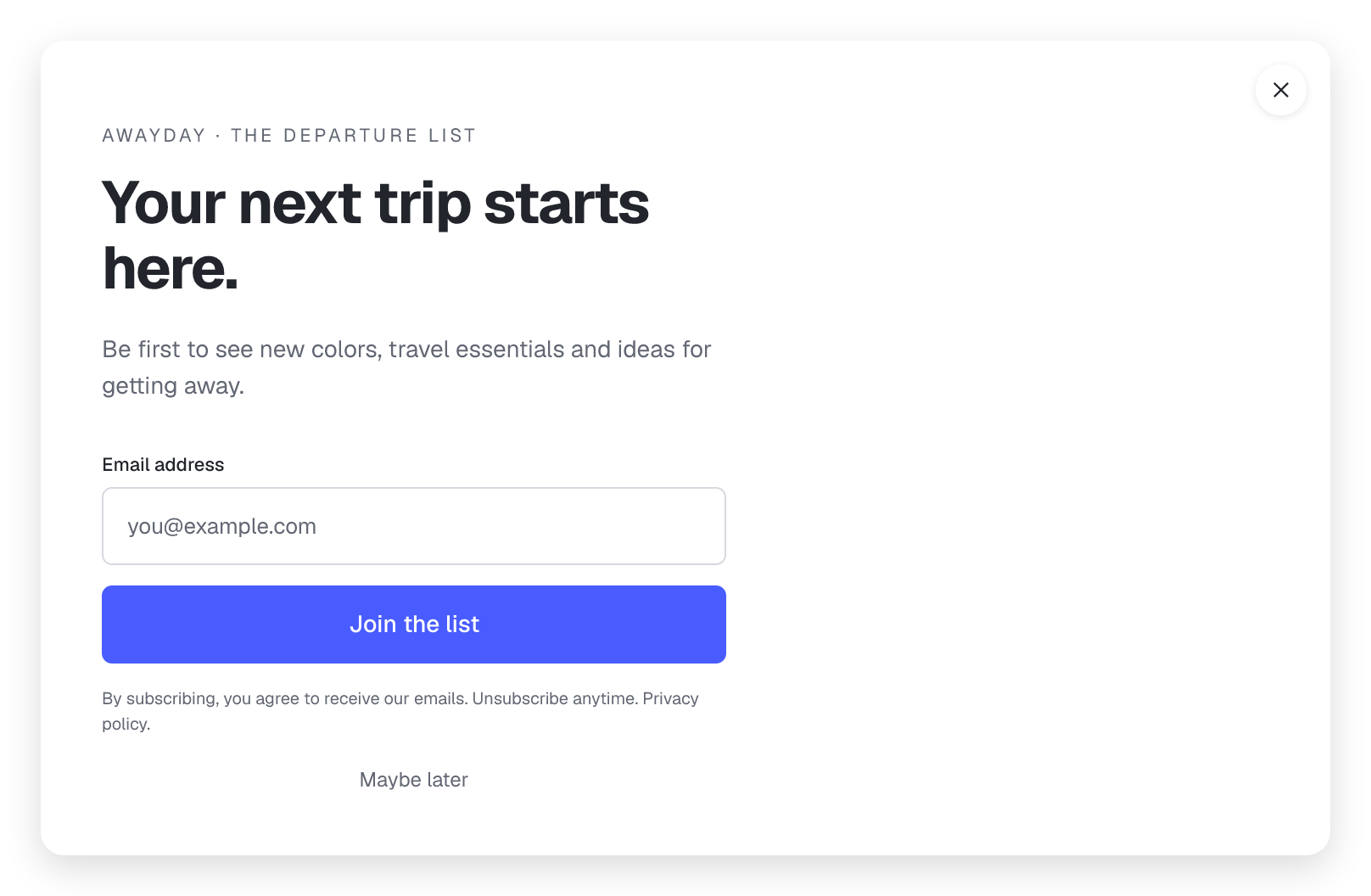
Create a newsletter popup, a contact form or an important announcement. Build it with the same blocks you already use on your pages.
- Combine a form, a photo and a clear call to action.
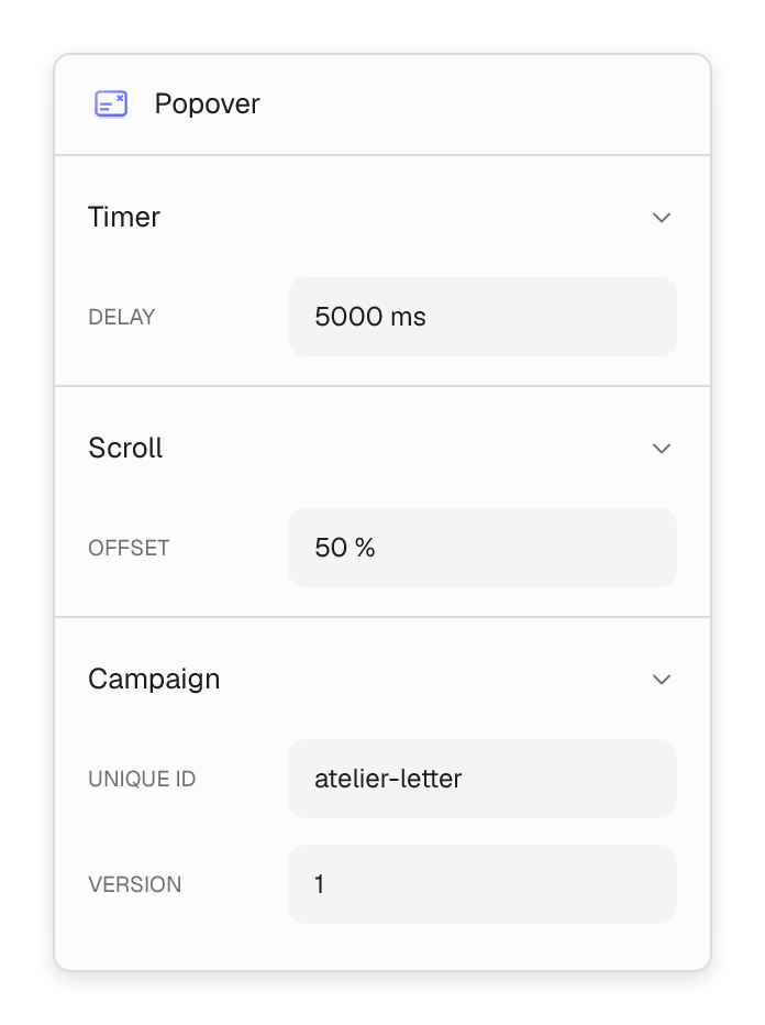
- Choose click, delay or scroll-based triggers.
- Style light and dark designs to match your site.

Design once. Give every item its place.
Design a card once and let your content fill it. Turn posts, products and categories into grids and sliders.



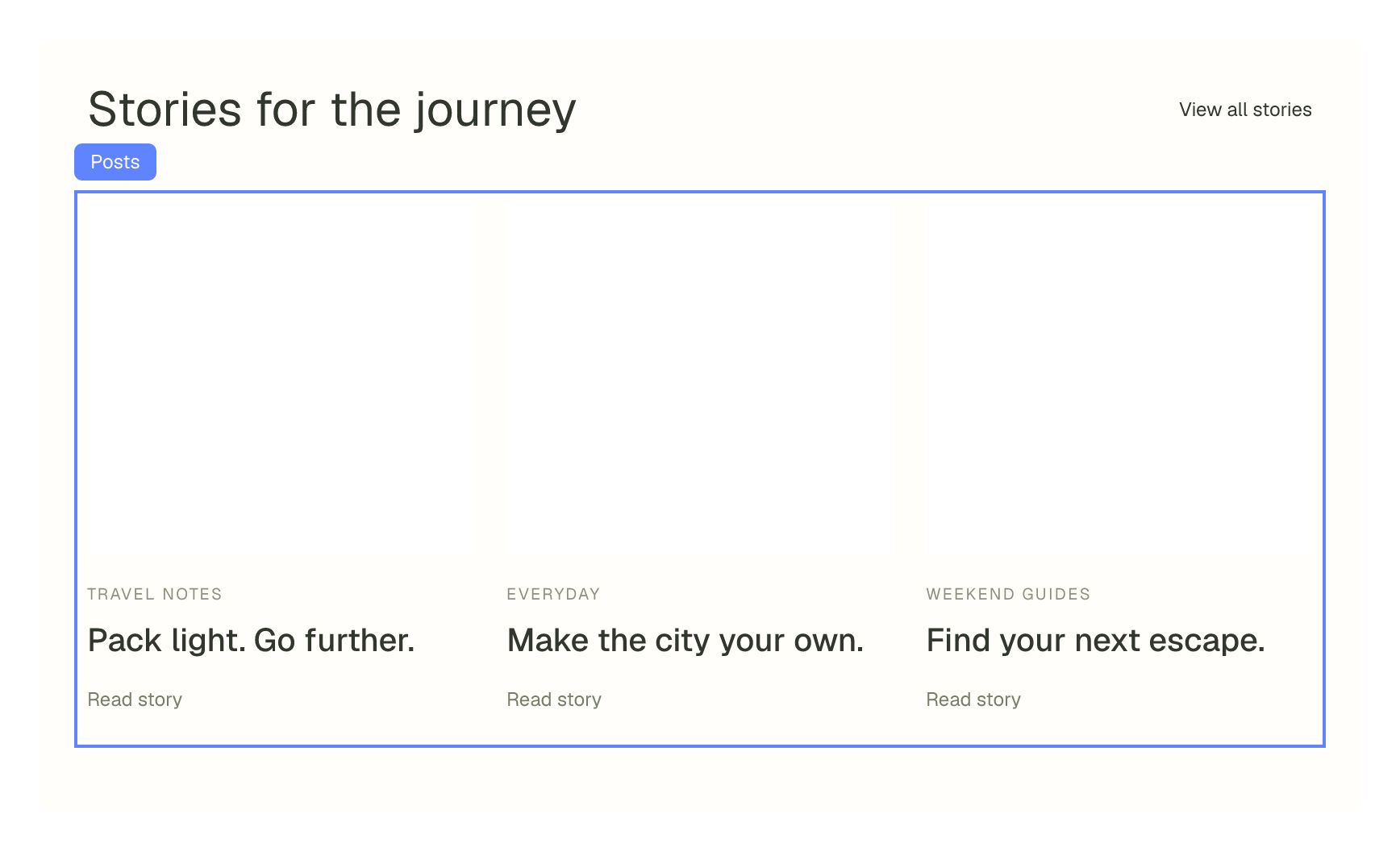
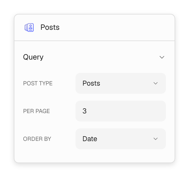
Post loops that keep the story moving.
Choose posts, categories, tags and ordering. Design the repeated card with its image, title, excerpt and link, then let new stories follow the same layout.
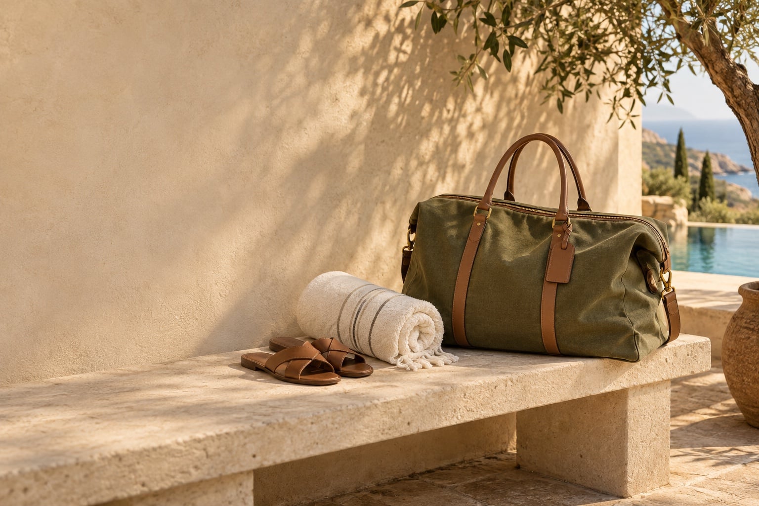


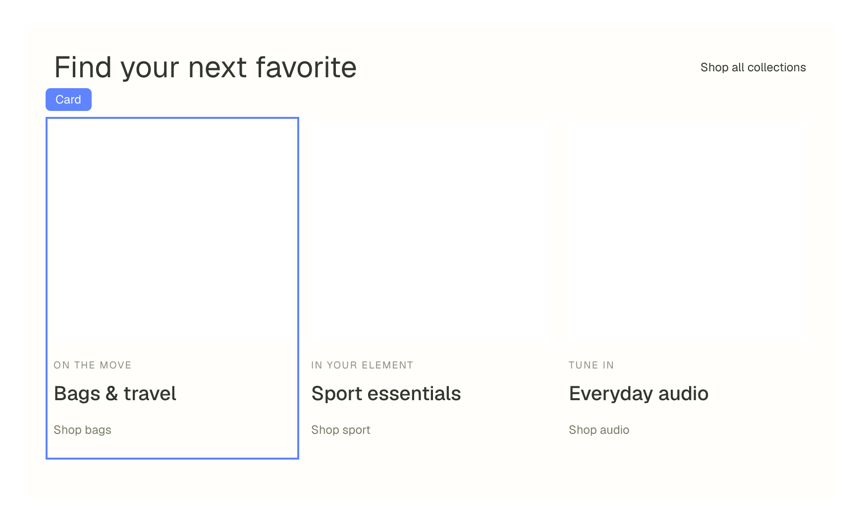
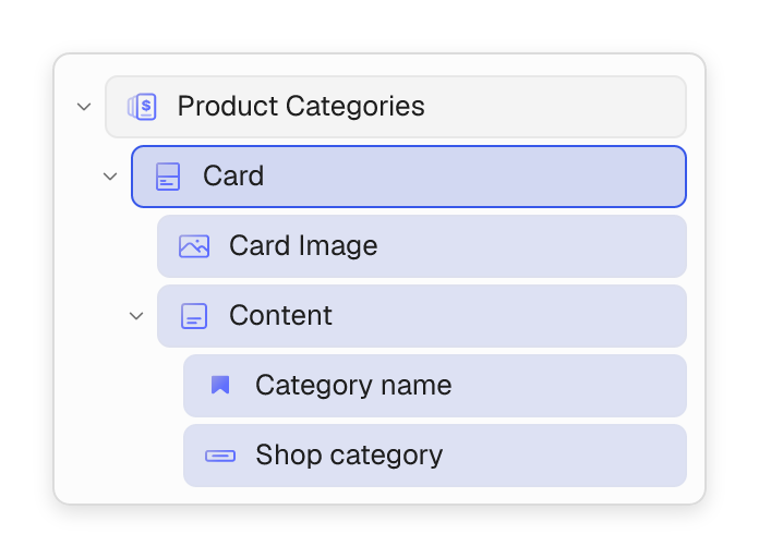
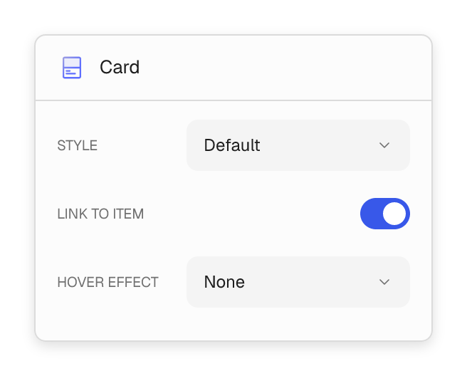
Cards for any kind of content.
Combine Card Image and Card Content, then repeat the design for posts, products or categories. Choose default, horizontal or overlay styles.
110 BLOCKS · 10 CATEGORIES
A block for every part of your site.
The main Flatsome blocks, grouped like the builder. Supporting blocks are listed with the blocks they belong to.
01 / 10 BLOCKS
Layout
Give every page its structure. Build sections, banners, sliders and headers, then fill them with content.

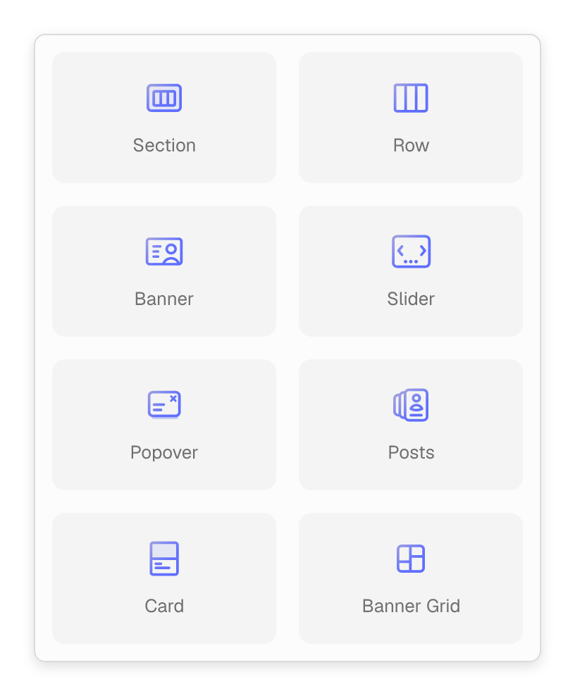
Section
Group a complete page section with its own background, spacing and shape dividers. Keep content aligned to your site’s layout.

Row
Arrange content in responsive columns. Set widths, alignment and gaps.

Banner
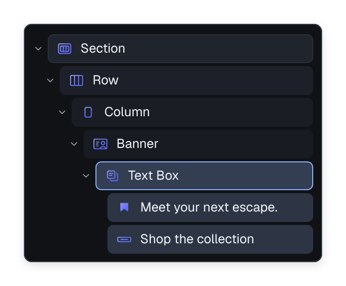
Create heroes with image or video backgrounds, positioned Text Boxes and clickable Hotspots.

Banner Grid
Combine banners of different sizes in one grid. Give each story, offer or category its own space.

Slider
Turn banners, cards or other blocks into a carousel, with arrows, dots, swipe navigation, autoplay and looping.

Flex
Arrange blocks horizontally or vertically with precise gaps and alignment. Useful for button groups, icon rows and compact layouts.

Marquee
Keep text, logos or images moving in a continuous horizontal ticker. Choose the scrolling speed and direction.

Header
Build a sticky site header with a main area, extra rows and announcement bars. Arrange your logo, navigation and buttons together.

Gap
Add breathing room between blocks with a spacer whose height can change for desktop, tablet and phone layouts.

Card
Design the image and content of a repeating card. Use horizontal or overlay layouts for posts, products and more.
Build further. Build inside these layouts with Column, Text Box and Hotspot. Headers include Header Main, Header Row, Header Column, Header Divider and Announcement Bar. Sliders include Viewport, Slider Button and Dots; cards contain Image and Content areas.
02 / 5 BLOCKS
Text
Shape the message from the first headline to the final call to action. Keep typography consistent while giving each piece of content the right emphasis.

Heading
Write page titles and section headings with the right heading level, responsive type size and alignment.

Paragraph
Add introductions, stories and supporting copy with rich text formatting.

Section Title
Introduce a section with a styled heading, an optional icon and a link to see more.

Button
Guide visitors to the next step. Choose a style, add an icon and set the link.

List
Present benefits, specifications or steps in an ordered or unordered list, with individual List Item blocks.
Build further. List Item adds the individual entries inside a List, including optional icons and tooltips.
03 / 8 BLOCKS
Media
Show the details that words cannot. Build galleries, add video, compare images and bring your brand and social profiles into the page.

Image
Display a single image with responsive sizing, captions, hover effects and optional links or a lightbox.

Gallery
Show images in a grid or slider. Visitors can open them in a lightbox for a closer look.

Video
Embed a self-hosted, YouTube or Vimeo video to show a product, explain a process or tell your story.

Video Button
Keep the page compact with a play button that opens a video in a lightbox when a visitor is ready to watch.

Image Comparer
Let visitors drag between two images to explore before-and-after results, material changes or visual comparisons.

Logo
Place a brand or partner logo with a controlled height and an optional link, ideal for headers and brand rows.

Follow Icons
Link to your social profiles with a coordinated row of Follow Icons and a choice of display styles.

Payment Icons
Show the payment methods your store accepts with recognizable icons and styles that suit your footer or product page.
Build further. Follow Button supplies each social profile link inside Follow Icons. Gallery captions can use the Caption block.
04 / 6 BLOCKS
Design
Add visual cues, supporting detail and social proof. These finishing blocks help visitors scan the page and understand what matters.

Icon
Add a visual cue from the icon library. Adjust its size and color to support a feature, service or piece of navigation.

Icon Box
Pair an icon with text to explain features, services or steps in a process.

Divider
Separate content with a horizontal line. Adjust its width, thickness and color to fit the surrounding design.

Testimonial
Present a real customer quote with its author, source and optional photo, styled to fit your page.

Rating
Display a configurable star or custom-icon rating. Useful for editorial scores and testimonial layouts.

Progress Bar
Visualize a chosen percentage with a horizontal progress bar. Adjust the fill and height to match the content.
05 / 14 BLOCKS
Forms
Build a contact form, product enquiry or newsletter signup. Add the fields you need to a reusable form, then place it on pages or inside a popover.

Form
Place a reusable form on the page. Its shared fields and settings stay together while you adapt its presentation to the layout.

Text Field
Collect a short answer such as a name, company or enquiry subject in a single-line text field.

Email Field
Ask for an email address with a dedicated input, ready for a signup, contact request or product enquiry.

Phone Field
Collect a phone number when an enquiry needs a callback or another way to contact the customer.

URL Field
Ask for a website or another web address with a field designed for URLs.

Textarea Field
Give visitors room for a message, project brief, product question or other longer answer.

Number Field
Collect a numeric answer with optional bounds, such as an order quantity or project requirement.

Choice Field
Offer predefined answers as radio buttons, checkboxes or a dropdown, depending on how visitors should choose.

Checkbox
Add a single checkbox for an acknowledgement, preference or optional choice within the form.

Date Field
Let visitors select a date for an enquiry or request using a date input.

Time Field
Collect a preferred time as part of a callback request, enquiry or other form.

Hidden Field
Submit a fixed value alongside the visible fields, such as a campaign identifier or enquiry source.

Group
Arrange related fields together with an optional legend and visibility conditions for the group.

Submit Button
Give the form a clear submit action with a button that fits the rest of your design.
06 / 13 BLOCKS
Interactive
Reveal more when visitors need it. Organize details, open popovers, add search and introduce purposeful motion and interaction.

Accordion
Organize FAQs and details into expandable panels. Allow one or several panels to stay open.

Tabs
Divide related content into tabbed panels with horizontal or vertical navigation and multiple visual styles.

Popover
Build a popup, dropdown or floating panel from blocks. Use it for newsletter forms, extra information or announcements.

Countdown
Count down to a launch, event or promotion using a target date and time with configurable timer styling.

Search
Add a compact search control that opens a dropdown, lightbox or full-screen search overlay.

Search Form
Place a search input directly in the layout, with optional WooCommerce product category filtering.

Message Box
Draw attention to an announcement or useful detail with a content box and its own background treatment.

Map
Embed an interactive Google Map with your location, zoom and styling to help visitors find you.

Lottie
Add a Lottie animation that plays on scroll or interaction.

Share Icons
Let visitors share the current page through a row of social sharing buttons, with individual Share Button blocks.

State Switcher
Add navigation buttons that switch between states defined by a parent block, keeping the controls in your own layout.
Product Tabs
Display WooCommerce product descriptions, reviews and attributes in a familiar tabbed layout on the product page.
Product Accordion
Present WooCommerce product information as expandable sections, useful when details should open on demand.
Build further. Accordion Panel holds each expandable item. Tabs use Tab List, Tab Panels and Tab Panel. Map can contain an Overlay, and Share Icons contains individual Share Buttons.
07 / 20 BLOCKS
Theme
Connect the whole site. Build navigation and mega menus, publish post collections and bring dynamic titles, dates and taxonomy content into your layouts.

Navigation
Create horizontal site navigation with dropdown submenus, configurable depth and styles that fit your header.

Mega Menu
Open a rich dropdown from a menu item. Build it from blocks with images, links and featured pages.

Off-Canvas Menu
Put navigation in a slide-out panel opened by a toggle button, ideal for mobile menus and compact headers.

Accordion Navigation
Build a vertical menu with expandable submenus, giving visitors a clear way through deeper navigation.

Slider Navigation
Let visitors move between menu levels with sliding panels inside an Off-Canvas Menu.

Navigation Card
Make a rich navigation link with an icon or image, description and tag, ideal for featured mega-menu destinations.

Menu
Organize footer or sidebar links in a vertical list with titles that group related destinations.

Page List
Display links to child pages in a vertical or horizontal list, useful for section navigation.

Language Switcher
Add a dropdown for switching site languages when your site uses Polylang or WPML.

Posts
Turn posts into a grid or slider. Choose the content and ordering, then design the repeated cards with blocks.

Terms
Display taxonomy terms as a grid or slider, with dynamic names, descriptions and counts inside the repeated layout.

Post Title
Display the current post title in a template or repeated card, with an optional link to the full story.

Post Excerpt
Show a short introduction to a post so visitors can decide which story to read next.

Post Author
Credit the post’s author and optionally link to their archive of published stories.

Post Date
Display the current post’s date in a card or post layout, with an optional link.

Post Date Badge
Turn the post date into a compact day-and-month badge for a more visual journal layout.

Post Terms
Show the categories, tags or other taxonomy terms attached to the current post.

Post Read More
Add a link from a post card or excerpt to the full article.

Widget Area
Include an existing WordPress widget area in your layout, such as a sidebar.

HTML
Embed custom HTML or a third-party widget when the content needs markup beyond the available blocks.
Build further. Navigation Link adds individual menu destinations. Menu includes Menu link and Menu title. Term Name, Term Description and Term Count supply dynamic content inside Terms and Product Categories.
08 / 31 BLOCKS
Products
Build the shopping experience from collection grids to product details and the mini-cart. These blocks connect your design to WooCommerce product and cart content.

Products
Build a product grid or slider with a repeated card design. Use it for collection pages and featured product sections.

Product Categories
Give shoppers a visual route into product categories or tags with a grid or slider of editable cards.
Product Image
Show the product’s featured image, with optional hover effects and a secondary image swap in product listings.

Product Gallery
Present the product image gallery with thumbnail navigation and a choice of layouts for exploring the details.

Product Title
Bring the WooCommerce product name into your product page or card design with its own typography treatment.

Product Price
Display the current product price with styling for regular and sale prices.

Product Short Description
Place the product’s short description near the information shoppers need before choosing to buy.

Product Quantity
Let shoppers choose a quantity with a stepper or plain input, positioned within the product layout.

Add To Cart
Add the WooCommerce purchase button and form for the current product to a product listing or supported product layout.

Buy Now
Add the current product to the cart and take the shopper straight to the cart or checkout.
View Product
Give a product card a clear link to its full product page.

Product Badge
Highlight a sale, new arrival or custom label on a product image with configurable badge positioning and styling.
Product Rating
Display the product’s average star rating from WooCommerce customer reviews.

Product Review Count
Show how many customer reviews a product has beside its rating or other product information.

Product Meta
Display useful product metadata such as the SKU, categories and tags.

Product Related
Recommend related products in a grid or slider on the product page.

Product Up-sells
Present the product’s configured up-sells to help shoppers discover alternative or upgraded options.

Product Next/Prev
Let shoppers move to the next or previous product without returning to the catalog.

Product Filters Toggle
Add a button that opens or closes product filters so shoppers can refine a catalog view.

Mini-Cart
Show a cart icon that opens a dropdown or drawer with current cart contents, an empty state and shopping actions.

Free Shipping
Show progress toward free shipping and how much more the shopper needs to spend to reach it.

Add to Wishlist
Let shoppers save a product to their wishlist when the store’s Wishlists feature is enabled.

Wishlist Nav Item
Add a wishlist link to the header with the number of saved items when Wishlists is enabled.

Breadcrumbs
Help visitors understand where they are in the site hierarchy and move back through the breadcrumb trail.

Checkout Breadcrumbs
Show the steps of the WooCommerce checkout journey so shoppers can follow their progress.

Product Hook
Include output from a selected WooCommerce or Flatsome product hook, useful when extending a product page with compatible integrations.

Product Deal Tiers
Show quantity-based savings in a tier table, with a highlighted current tier and click-to-set quantity. Requires Dynamic Pricing.

Product Deal Price
Show the quantity-break price for the selected quantity alongside the product’s pricing. Requires Dynamic Pricing.

Product Deals
Explain available buy-X-get-Y product deals with a status hint that responds to the cart. Requires Dynamic Pricing.

Cart Deals
Show cart-wide spending deals, including the amount still needed to unlock the next offer. Requires Dynamic Pricing.

Estimated Delivery
Show delivery information when the current product matches your delivery rules, using Product Estimated Delivery inside. Requires Estimated Delivery.
Build further. Product Category, Product Review Rating and Product Quick View add detail to product and review loops. The mini-cart includes Mini-Cart Content, Filled Mini-Cart, Empty Mini-Cart, Mini-Cart Items, Mini-Cart Footer, Mini-Cart Subtotal and Shop Button. Wishlist blocks require the Wishlists feature. Deal blocks require Dynamic Pricing; delivery blocks require Estimated Delivery.
09 / 2 BLOCKS
WooCommerce
Add customer account access to the store. These Flatsome blocks sit in the builder’s WooCommerce category alongside WooCommerce’s own blocks.

Account Nav Item
Add an account icon to the header that opens the login lightbox or takes signed-in shoppers to their account.

Account Menu
Display the WooCommerce account navigation with customizable links so customers can find their account sections.
10 / 1 BLOCKS
Embeds
Bring connected content into your site alongside the builder’s other embed options.

Display images from a connected Instagram account in a grid or slider to bring your social content into the page.