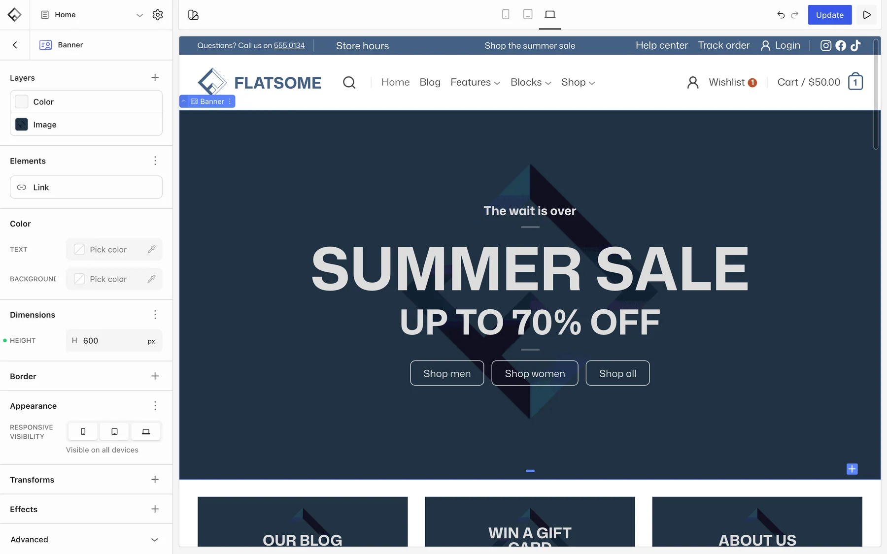
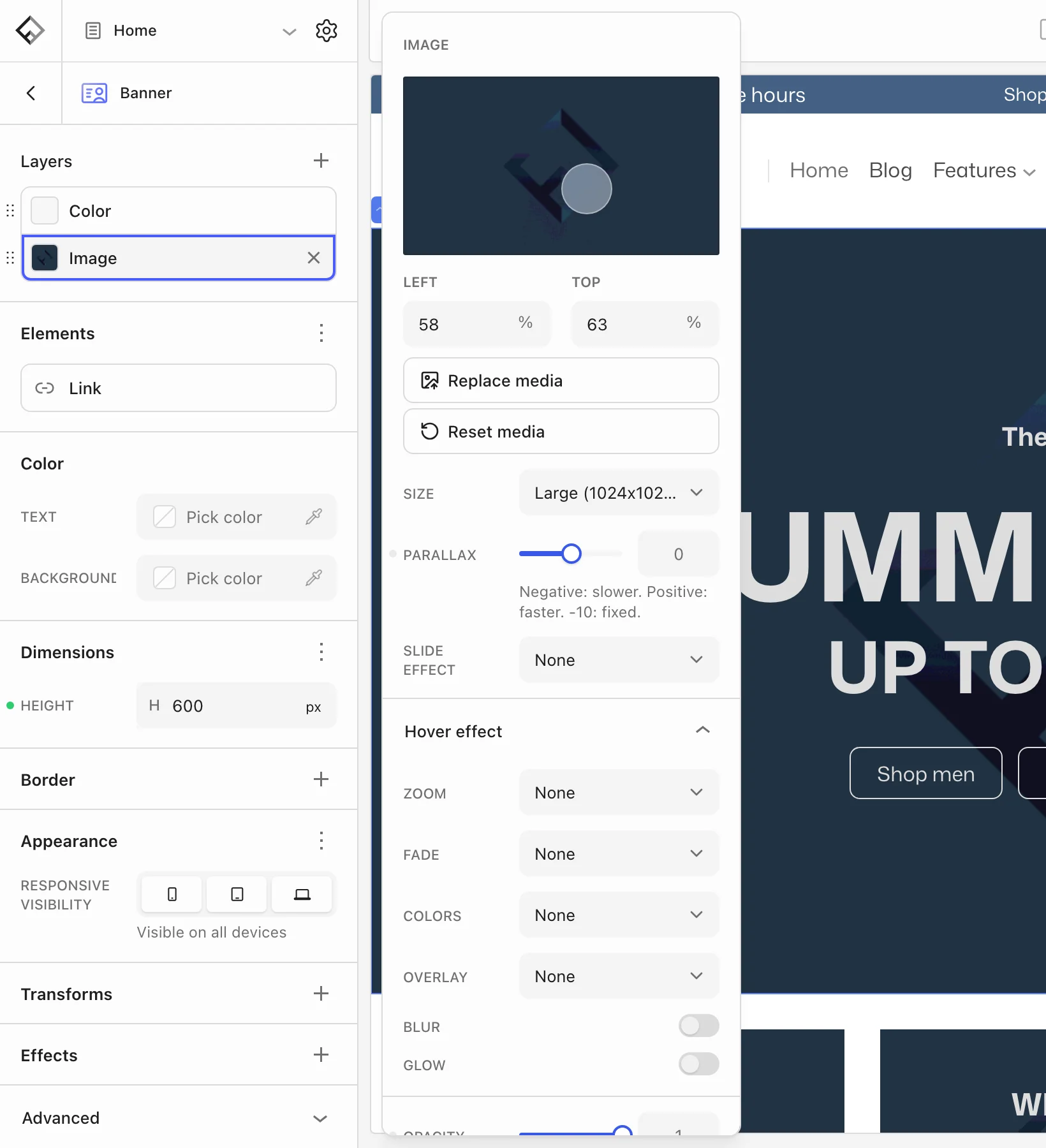
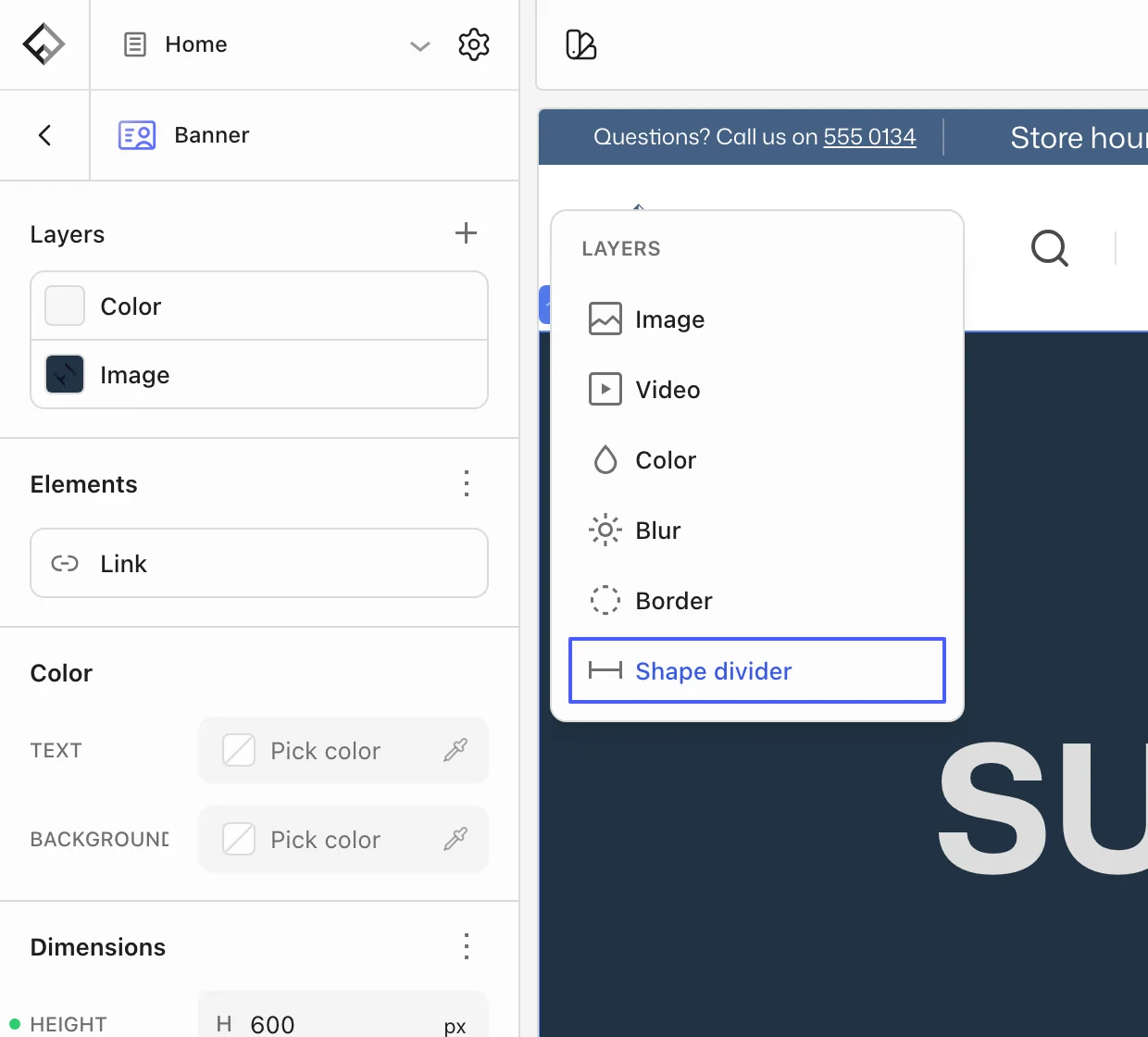
A versatile hero section with background image/video, text overlays, and optional link. Supports hotspots and shape dividers.
| Name | flatsome/banner |
|---|
Attributes
| Name | Type | Default | Description |
|---|---|---|---|
background |
object |
— | — |
color |
string |
— | — |
focalPoint |
string |
— | block:flatsome/image#/attributes/focalPoint |
hoverEffect |
object |
— | block:flatsome/image#/attributes/hoverEffect |
id |
object |
— | block:flatsome/image#/attributes/id |
overlay |
object |
— | block:flatsome/image#/attributes/overlay |
size |
object |
— | block:flatsome/image#/attributes/size |
slideEffect |
string |
— | Only use when inside a slider. Enum: fade-in, zoom-in, zoom-out, fade-in-fast, zoom-in-fast, zoom-out-fast |
link |
object |
— | — |
type |
string |
— | Post type slug for archive links. |
id |
number |
— | — |
kind |
string |
— | Link type: post, term, archive, or custom. Enum: post, term, archive, custom |
linkToPost |
boolean |
— | — |
rel |
string |
— | — |
target |
string |
— | — |
url |
string |
— | — |
sticky |
boolean |
No | Sets position: sticky. |
video |
object |
— | block:flatsome/video#/attributes |
Block Supports
| Property | Value |
|---|---|
align |
wide, full |
flatsomeBorder |
Yes |
flatsomeBorderOverlay |
Yes |
flatsomeBuilder.category |
flatsome-layout |
flatsomeBuilder.droppable |
No |
flatsomeBuilder.priority |
3 |
flatsomeFeedback |
Yes |
flatsomeScrollAnimation |
Yes |
flatsomeShadow |
Yes |
flatsomeShapeDividers |
Yes |
flatsomeSlider |
Yes |
flatsomeSpacing.margin |
Yes |
flatsomeStyle.height.description |
Default: 30cqw. |
flatsomeStyle.height.property |
height |
flatsomeStyle.height.type |
string |
flatsomeTransforms |
Yes |
html |
No |
interactivity |
Yes |