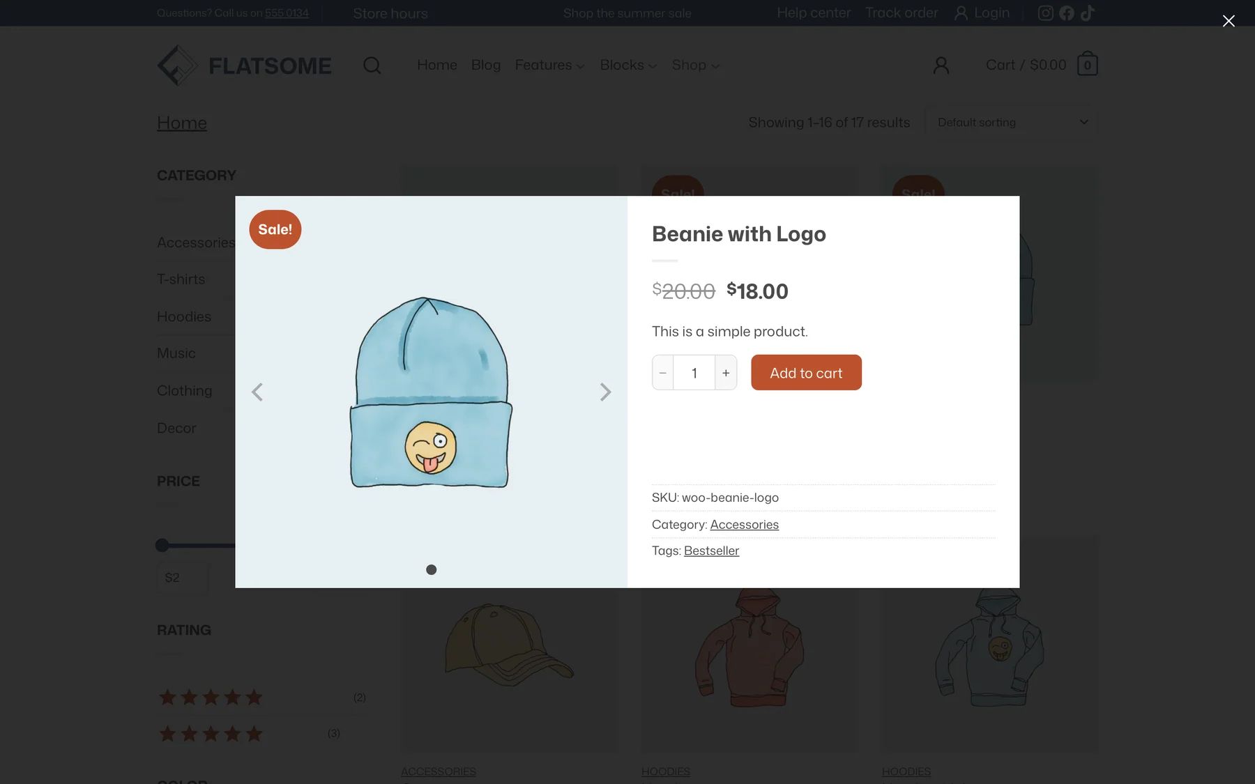
Quick view opens a product in a popup straight from a listing, with the gallery, price, and add-to-cart form, so shoppers can buy without leaving the page. It is a button on the product card plus a template part that defines what the popup shows.
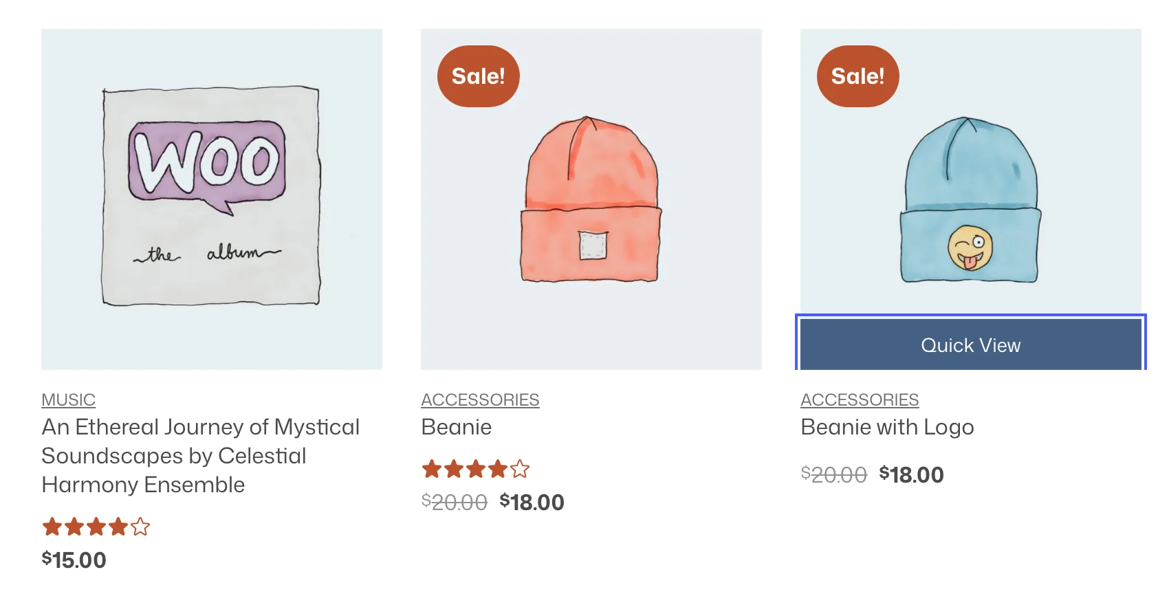
The button
The Product Quick View block sits on the product image in the shop template and in every new Products block. Select it to change:
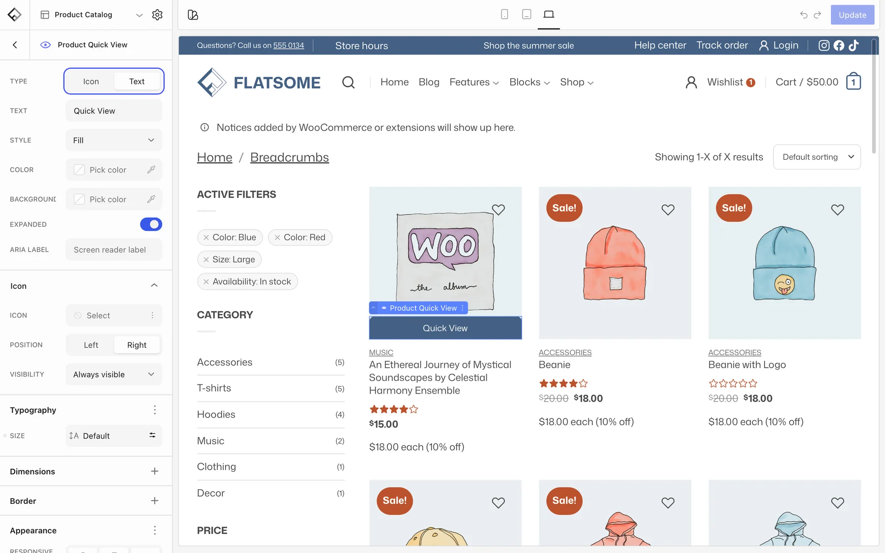
- Type: Text for a labeled button or Icon for a small eye or zoom icon.
- Text: the label, Quick View by default.
- Icon → Visibility: Visible on hover shows the icon only when the pointer is over the card. On the product image, the button itself appears when shoppers hover the card or tab to it.
- Expanded: stretch the button across the full width of the image.
To remove quick view, delete the block from the card. To add it to a listing that lacks it, insert it inside the Card Image of the product card.
The popup
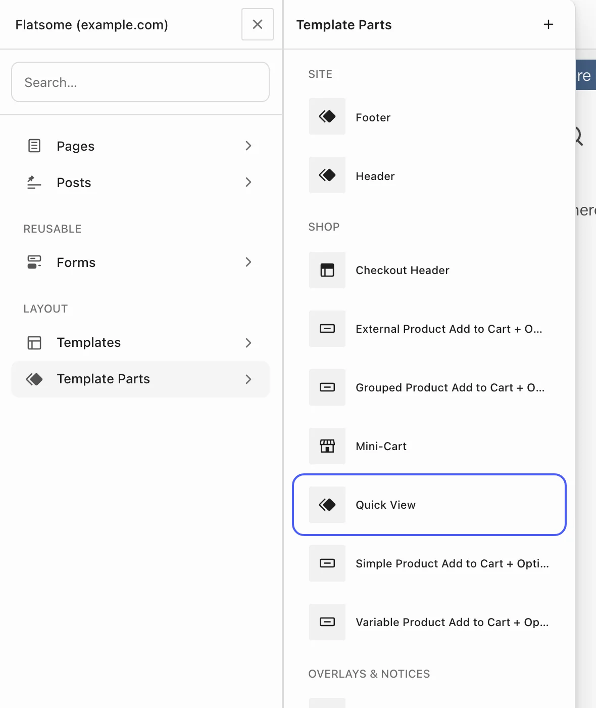
In the Builder, open the navigator from the title at the top left, choose Template Parts, and then Quick View under Shop. It is a two-column row: the product gallery with badge and wishlist button on the left, and the title, price, short description, add-to-cart options, and meta on the right. Any product block can be added, for example Product Rating, Buy Now, or a View Product link to the full page.
The popup content loads on demand when the button is clicked, so the listing page stays as fast as before.