


The footer is a template part shared by every template. It starts out as a single copyright line, and you build it up with ordinary blocks: sections for background color, a row for columns, menus for links, and payment icons for the bottom bar.
Open the footer
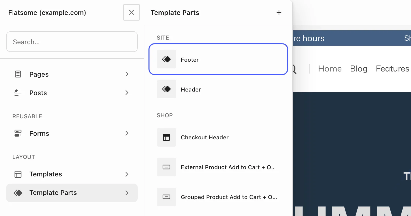
In the Builder, go to Template Parts and choose Footer under Site. Changes apply everywhere once saved.
Open from the admin bar
When you are logged in and viewing your site, hover Edit with Flatsome Builder in the admin bar and choose Edit Footer. The Builder opens with the footer ready to edit. In the dashboard, the same admin bar menu has Template Parts → Footer instead.
Build the columns
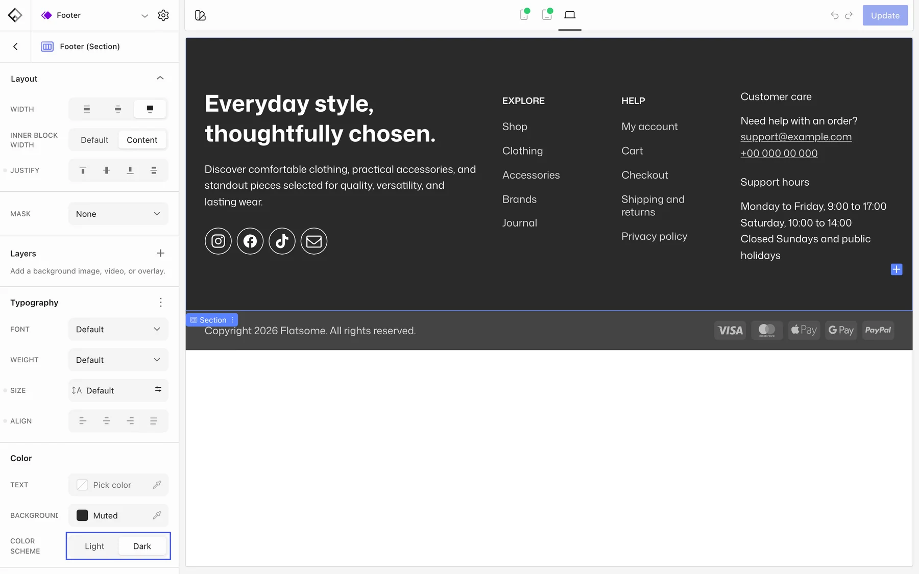
- Add a Section. Set its Background and, for a dark footer, set Color scheme to Dark so text and links flip to light colors.
- Inside it, add a Row with one Column per footer column. Set each column’s Width per breakpoint, for example 3 of 12 on desktop and 6 on phones.
- Fill the columns: a Logo and short text, Menu blocks with a Menu title and Menu links, contact details, or a newsletter Form.
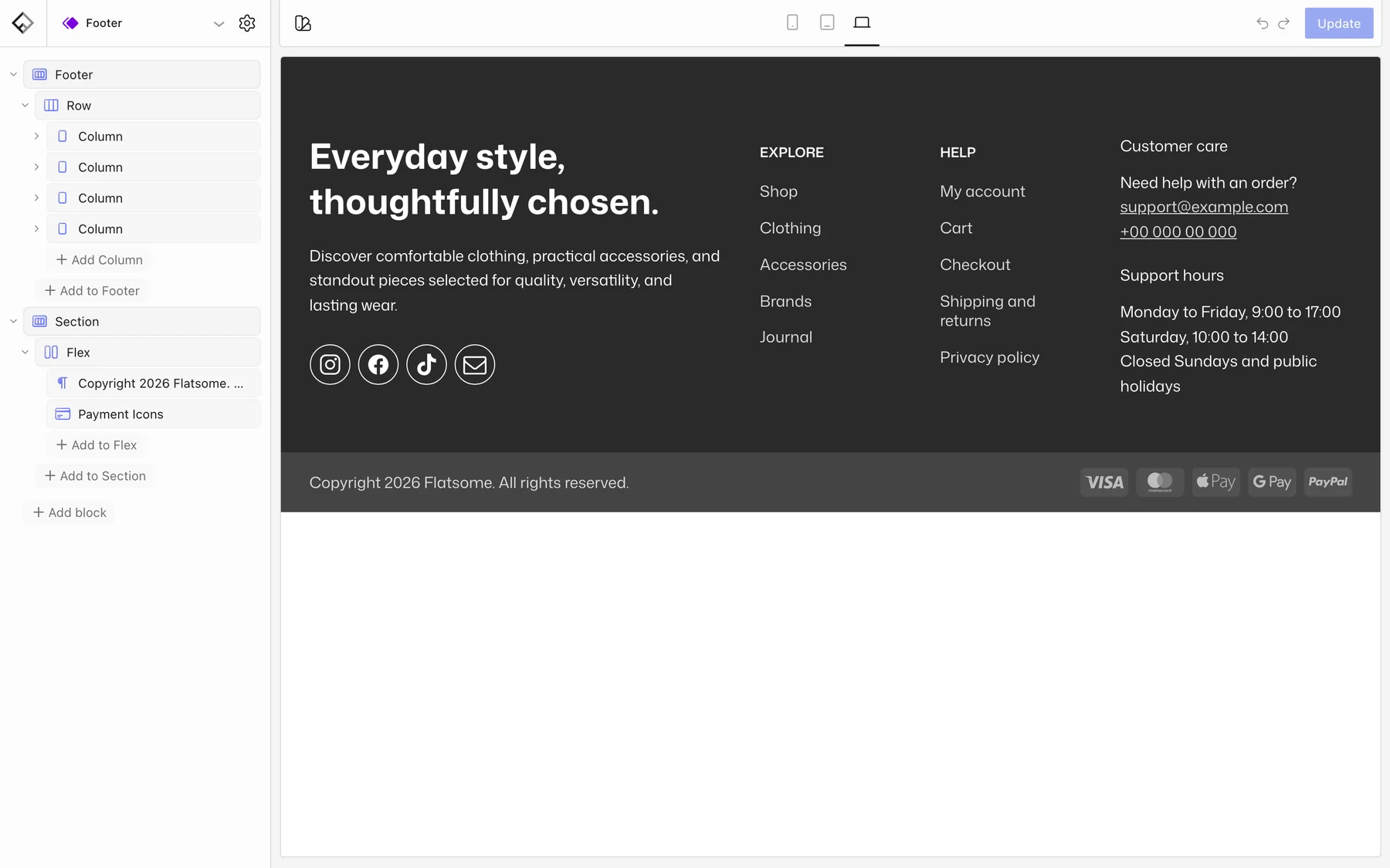
The Menu block is made for footers: a vertical list you type links into, with an optional divider. To reuse a navigation menu you manage elsewhere, use the Accordion Navigation block and pick the menu under Menu.
Add the bottom bar
- Add a second Section with a slightly different background.
- Add a Flex block, set its direction to row on desktop and column on phones, and justify Space between.
- Put the copyright Paragraph on one side and a Payment Icons block on the other.
Payment icons
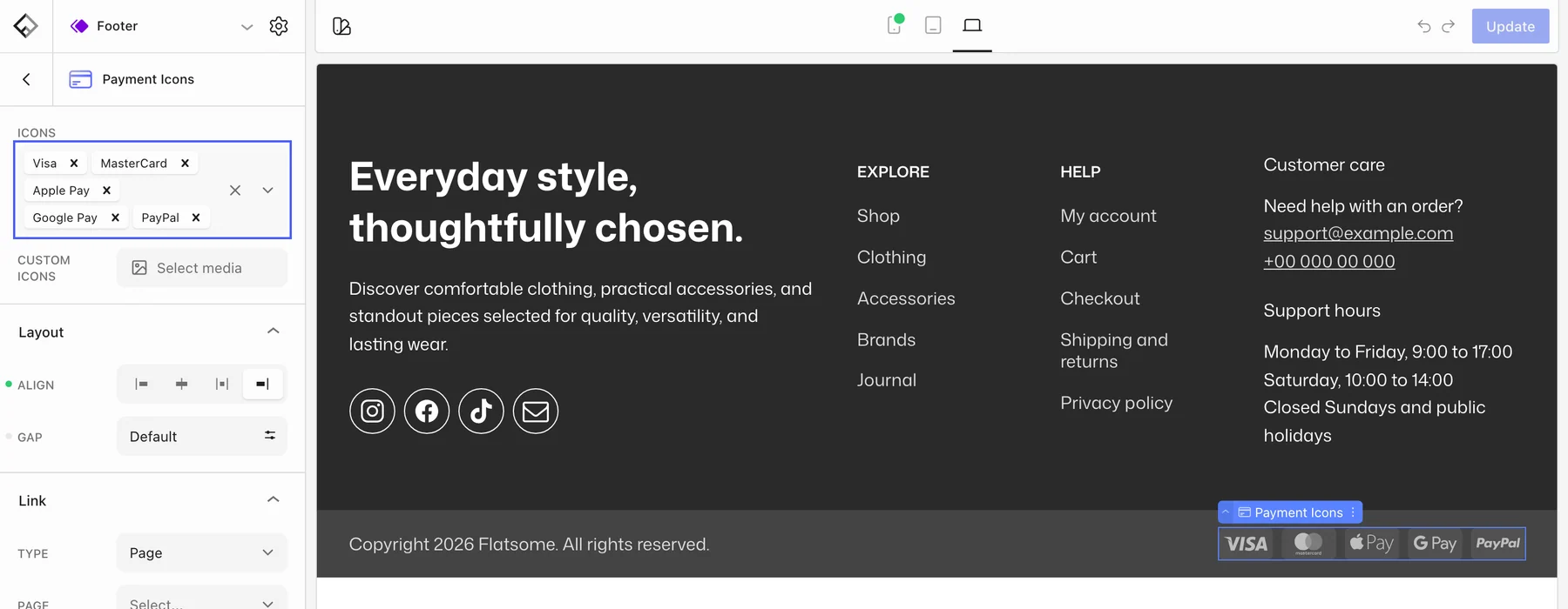
Pick the methods under Icons and drag to reorder them. The list covers cards, wallets such as Apple Pay and Google Pay, bank transfer schemes, Klarna, PayPal, Stripe, and more. Custom Icons lets you upload your own image instead. Adjust Background color and Border radius under Icon to match a dark footer, and the block’s font size to scale the icons.
Social links
Add a Follow Icons block in any column. See Add social follow and share links.