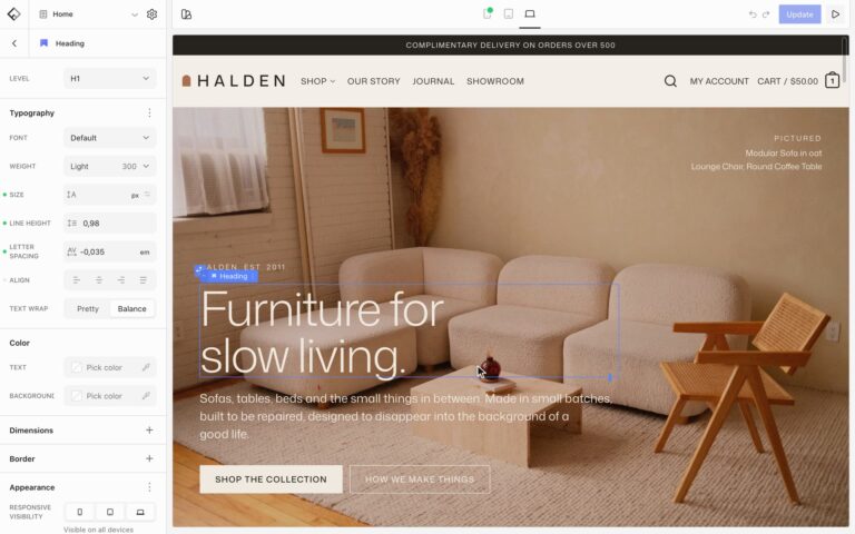
The Image block shows one image with an optional link, lightbox, caption, and hover effect. It can show a different image on each screen size and reach past its column.
Settings
- Size: the image size to load. Pick one close to the size it is shown at.
- Caption: shows the caption from the media library, Always or On hover.
- Click behavior: On click can open a link, a lightbox, the attachment page, the current post, or a video. See Open images in a lightbox.
A different image on phones
Choose another image while previewing Tablet or Mobile, and visitors on that size see it instead. Only the image for their screen downloads. See Edit for each screen size.
Extend beyond the column
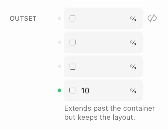
Open the options menu of the Dimensions panel and add Outset. Set how far the image reaches past its column on each side, in %, px, rem, or vw. The layout stays aligned to the column, so text beside the image doesn’t move. Outset can be different on each screen size.
Hover effects
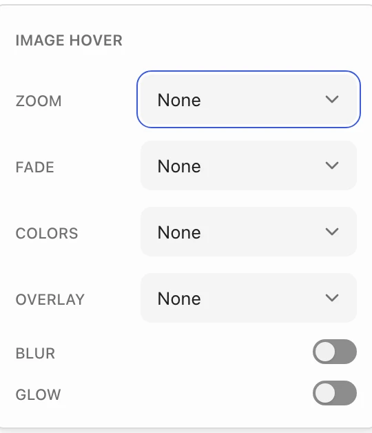
Open the options menu of the Effects panel and add Image hover. Choose a Zoom, Fade, Colors, or Overlay effect, and turn on Blur or Glow. For changes to the whole block, such as a lift or a shadow, see Hover effects and container links.