On small screens the header shows a menu button that opens a slide-out panel. The button and the panel are one block: Off-Canvas Menu. What the panel contains is up to you.
Add the menu button
- Open the header in the Flatsome Builder (Template Parts → Header).
- Insert an Off-Canvas Menu block into a Header Column, usually the left column of Header Main. The default header already has one.
- Pick the icon and an optional label for the button.
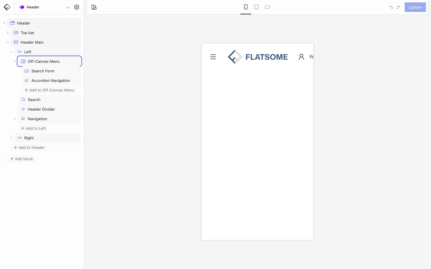
Fill the panel
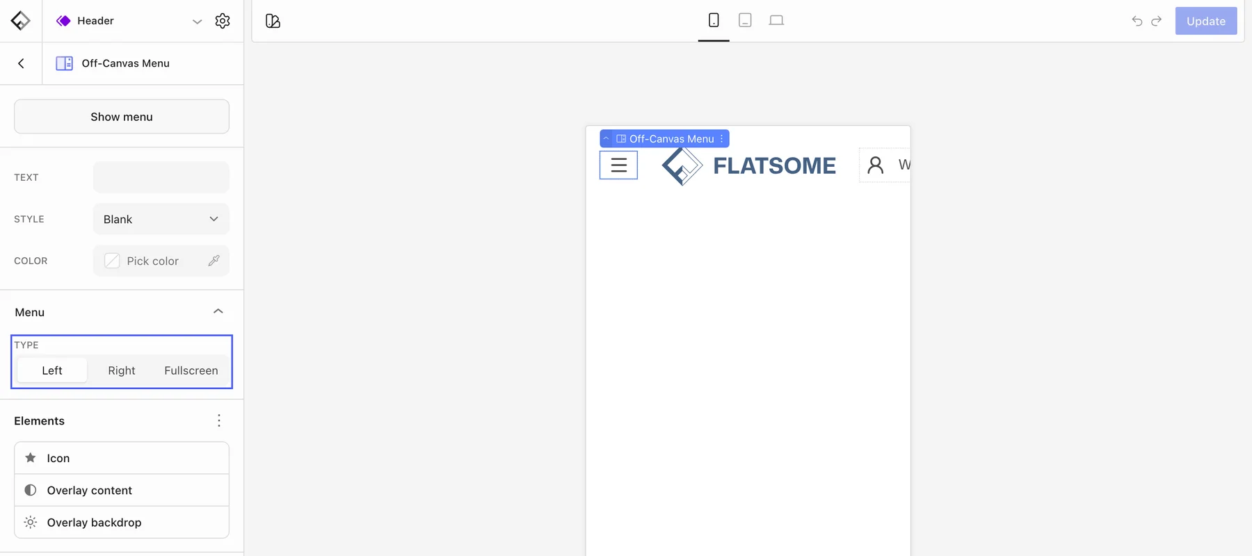
Select the Off-Canvas Menu block and click Show menu at the top of its settings to open its panel on the canvas, then add blocks inside it. The usual contents are:
- Accordion Navigation: the menu as a vertical list where submenus expand in place.
- Slider Navigation: the menu as panels that slide sideways into each submenu.
- Search Form, Page List, Language Switcher, text, images, buttons, Gap, and Divider blocks.
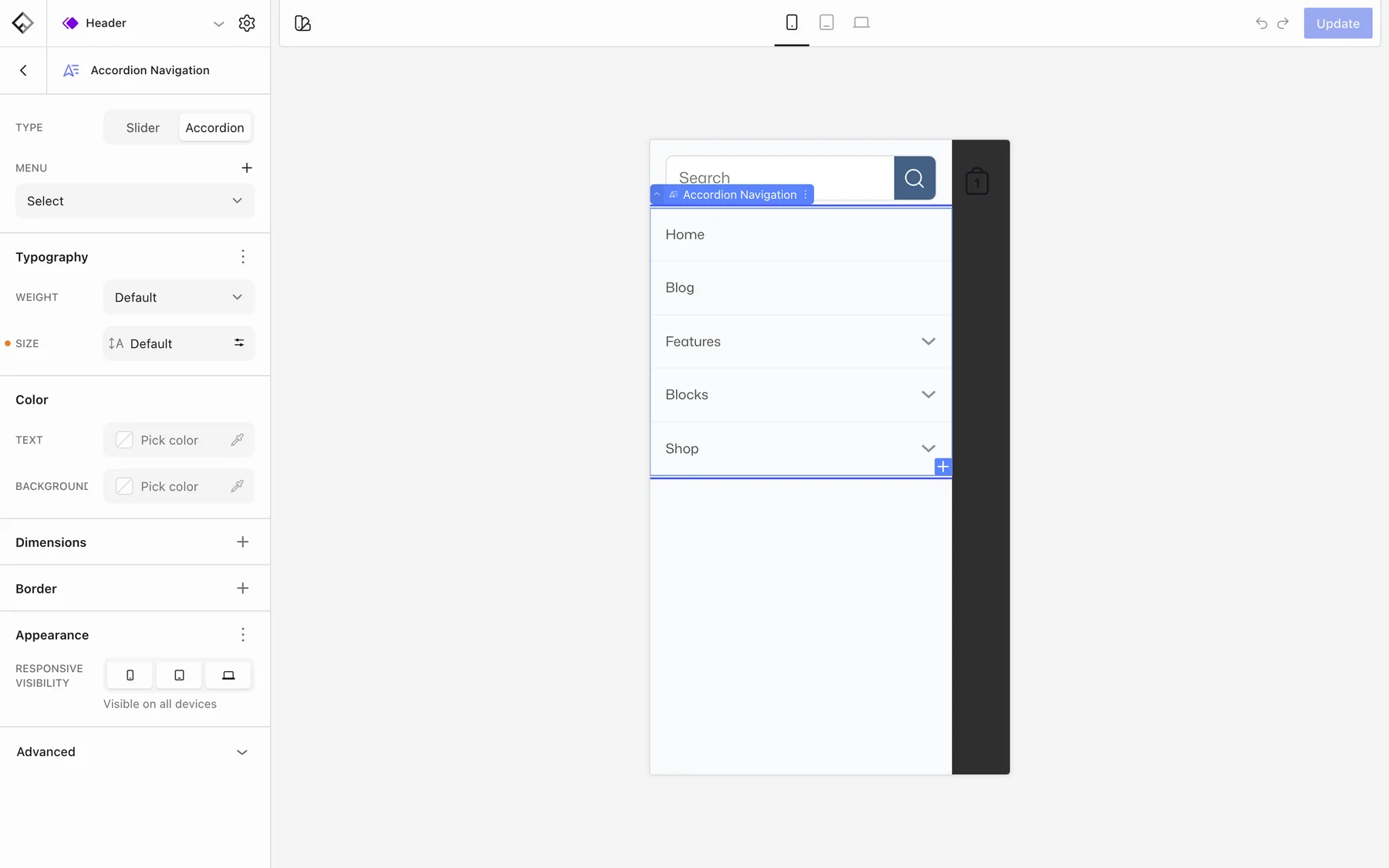
Point the navigation block at the same menu the desktop Navigation uses to keep both in sync, or pick a different menu to give phones their own, shorter menu.
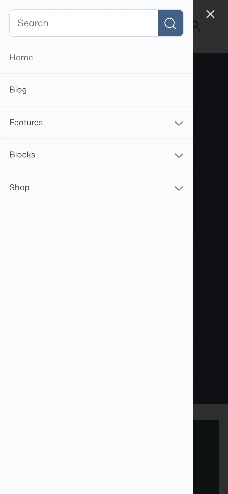
Panel settings
- Type: slide in from the Left or Right, or open Fullscreen.
- Overlay content: background, text color, color scheme, and width of the panel.
- Overlay backdrop: the dimmed layer behind the panel.
Show it only on small screens
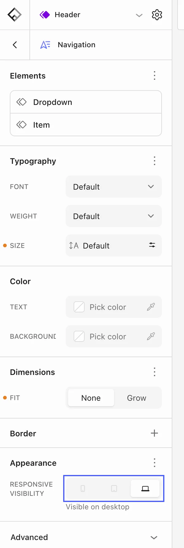
Visibility is set per block. In the default header the Off-Canvas Menu is visible on mobile and tablet only, while the desktop Navigation, Search, and Header Divider are hidden on tablet and phone. To change when the menu button appears, select it and turn screen sizes on or off under Responsive visibility in the Appearance panel. The same setting on the Navigation block controls when the horizontal menu disappears.