


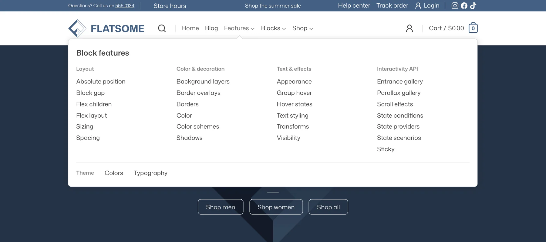
A mega menu is a menu item whose dropdown is a free-form panel. Instead of a list of links, the panel can hold columns, images, product grids, banners, or anything else you can build with blocks.
Add a mega menu item
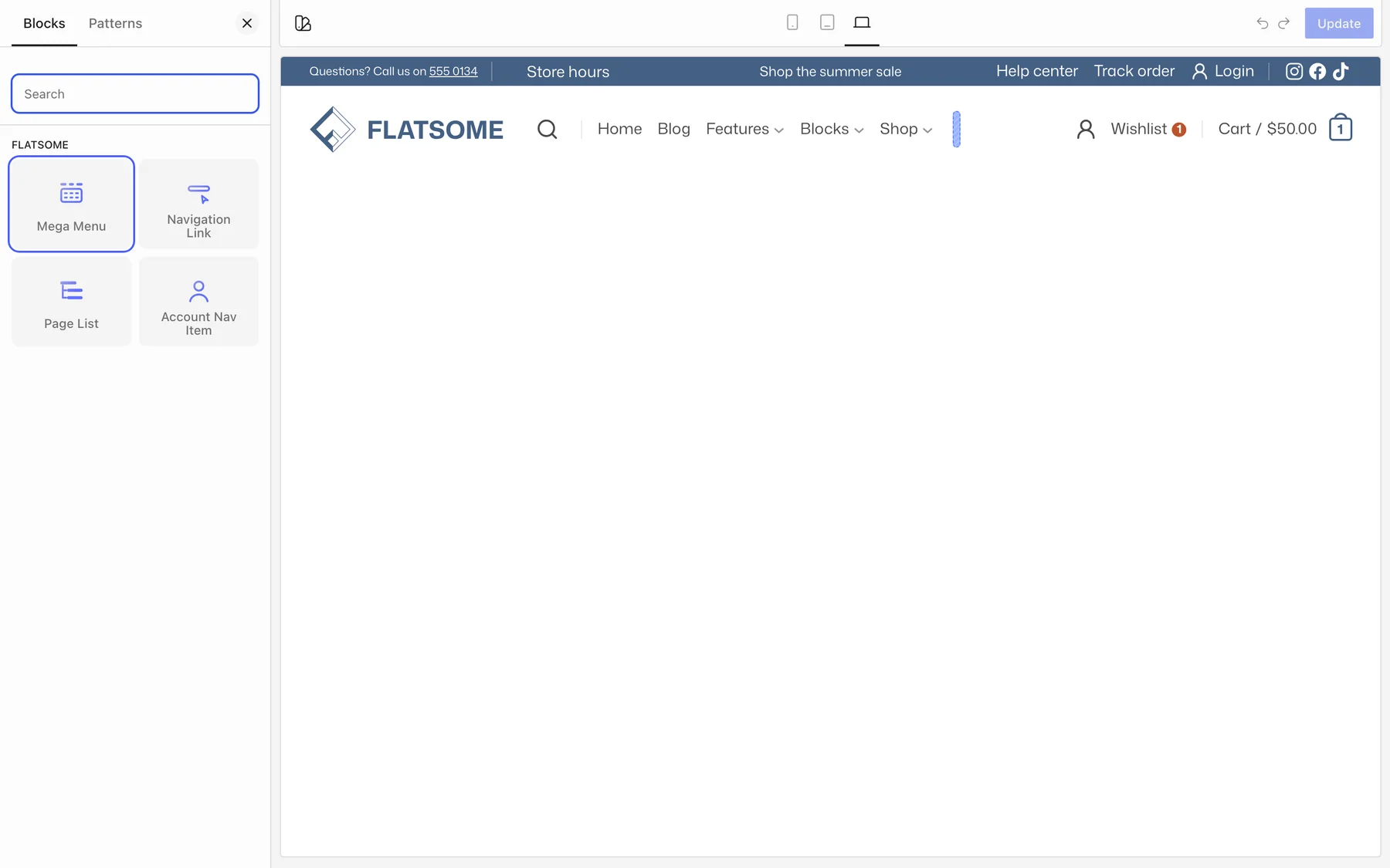
- Open the header in the Flatsome Builder (Template Parts → Header) and select the Navigation block.
- Add a new menu item and choose Mega Menu instead of a regular Navigation Link. Pick a starting layout (Mega Menu, Menu Columns, Menus with Image, or Vertical Tabs) or start from an empty panel. An existing item can also be transformed into a Mega Menu.
- Give it a label and, optionally, a link. The link can point to a page, post, category, archive, or a custom URL.
- Add blocks inside the item. They become the dropdown panel.
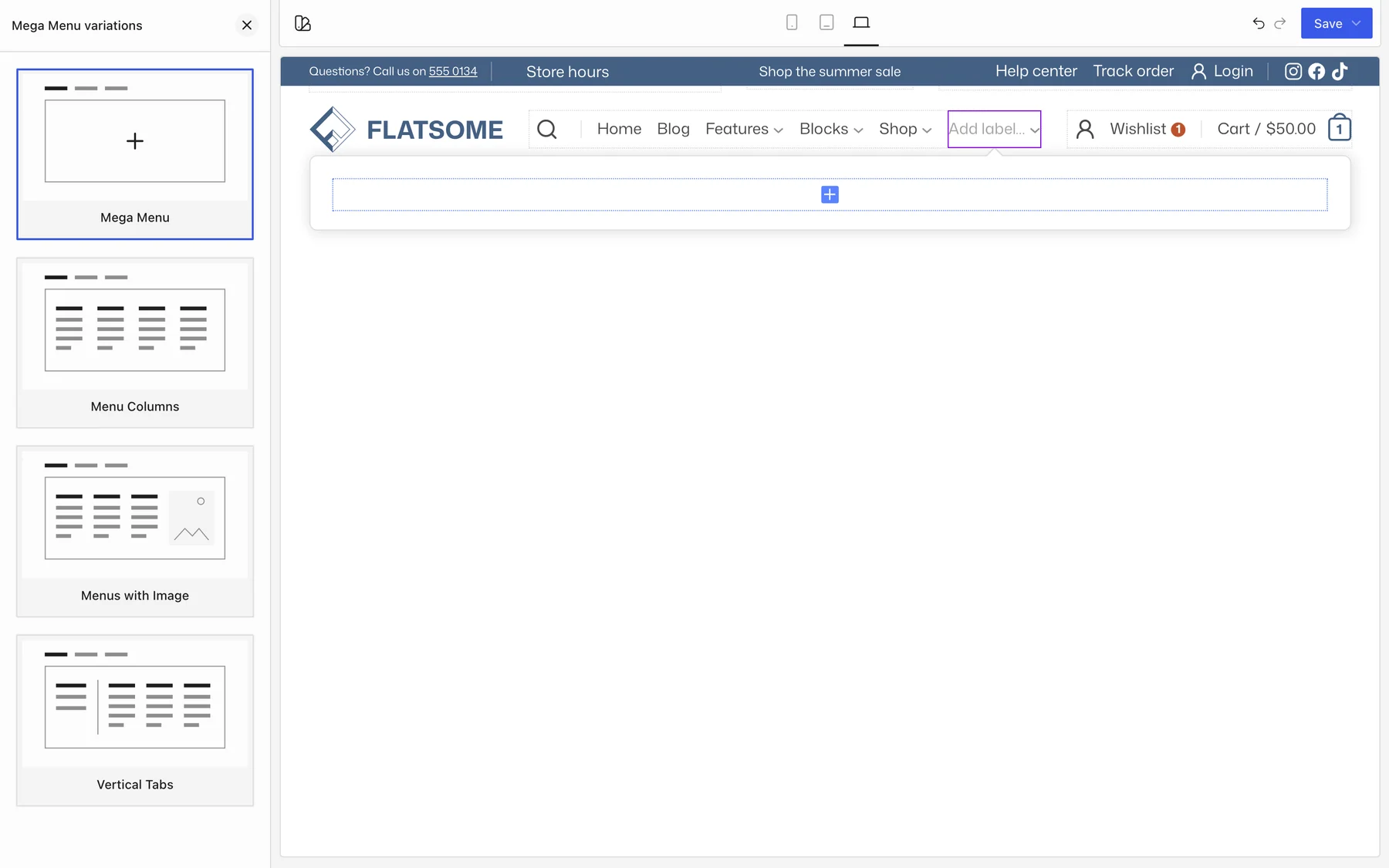
A good starting point is a Row with three or four Columns. Put a Menu block with links in each column, or use Nav Card blocks for links with an icon, image, and description. Product blocks, Banners, and Images work too.
Panel settings
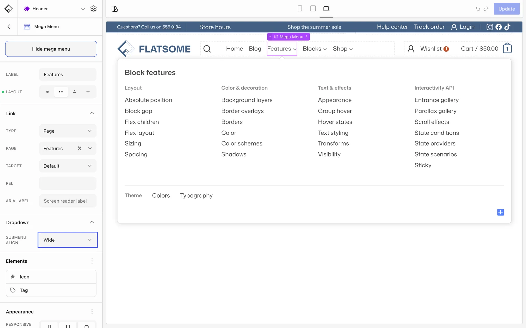
- Submenu align: Wide sizes the panel to its content, and Full stretches it to the full site width.
- Content align: how the panel content is aligned. It appears when Submenu align is set to Full.
- Dropdown on the parent Navigation block, under Elements: padding, width, background, border, and radius of the panel. These apply to all the dropdowns in that navigation.
- Tag: a small badge next to the label, such as New or Sale.
Where the content is stored
Menu items, including mega menu panels, belong to the navigation menu, not to the header. Every block that shows the same menu (the desktop Navigation and the Accordion Navigation inside the mobile menu, for example) shows the same items. On small screens the mega menu panel is rendered inside the accordion, so keep the panel content simple enough to work in a narrow column, or hide heavy blocks on phone with their Visibility settings.
To reuse the same panel content in several menus, put it in a synced pattern and insert the pattern into each mega menu. See Reuse content with patterns.