


The Slider block turns any group of blocks into slides. Banners make hero sliders, images make carousels, and testimonials or product cards work just as well. Nothing is limited to images.
Add a slider
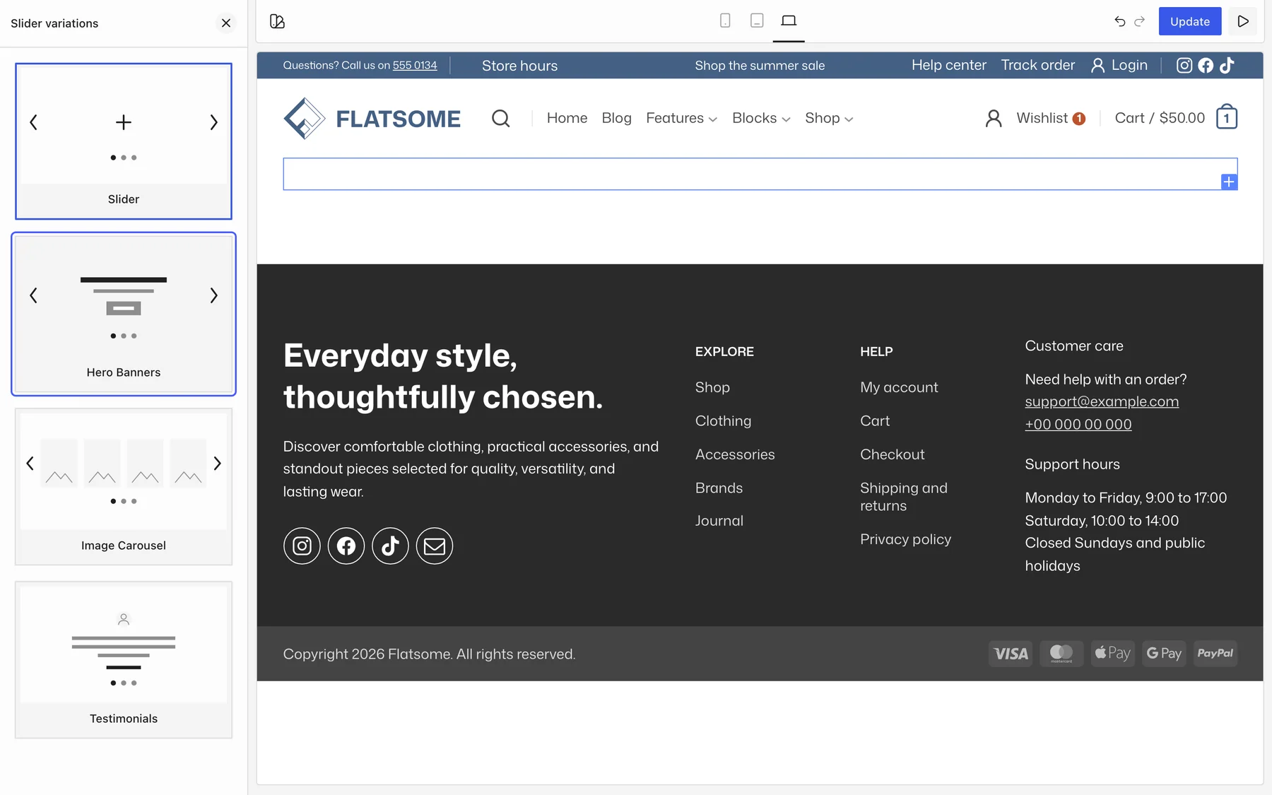
- Insert the Slider block and pick a starting point: Slider, Hero Banners, Image Carousel, or Testimonials.
- Each direct child of the Viewport is one slide. Add Banner, Image, Row, or Section blocks to add slides, and duplicate a slide to keep its design.
- Set a Height on the Viewport per breakpoint, or leave it to size by content.
Slider settings
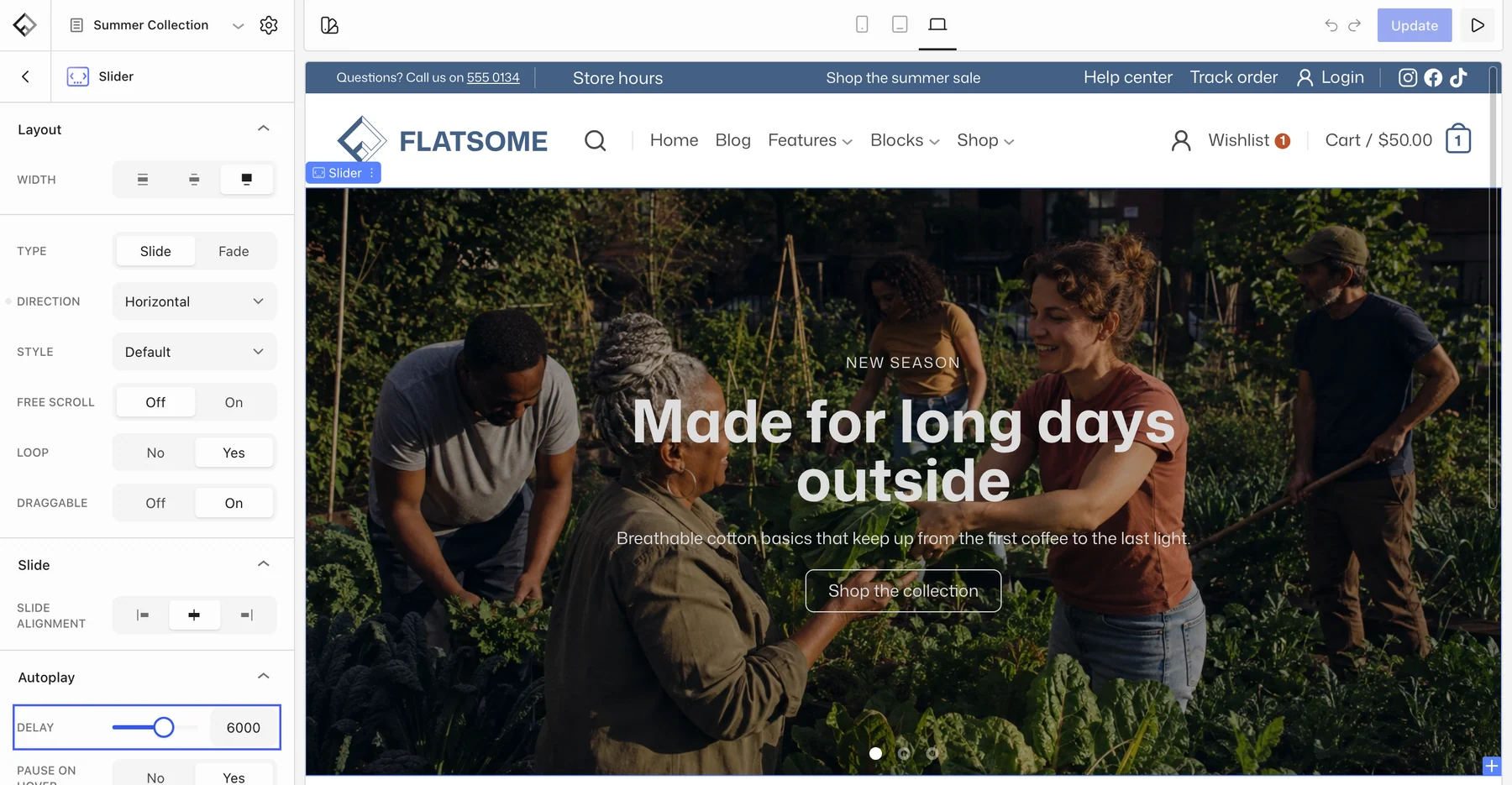
- Type: Slide or Fade.
- Autoplay → Delay: milliseconds between slides, up to 10 seconds. Pause on Hover stops it while the pointer is over the slider.
- Loop and Draggable: wrap around at the end and allow swiping.
- Style: Container keeps slides inside the content width; Focus dims the slides beside the active one.
- Free scroll for a more editorial feel.
Several slides at once
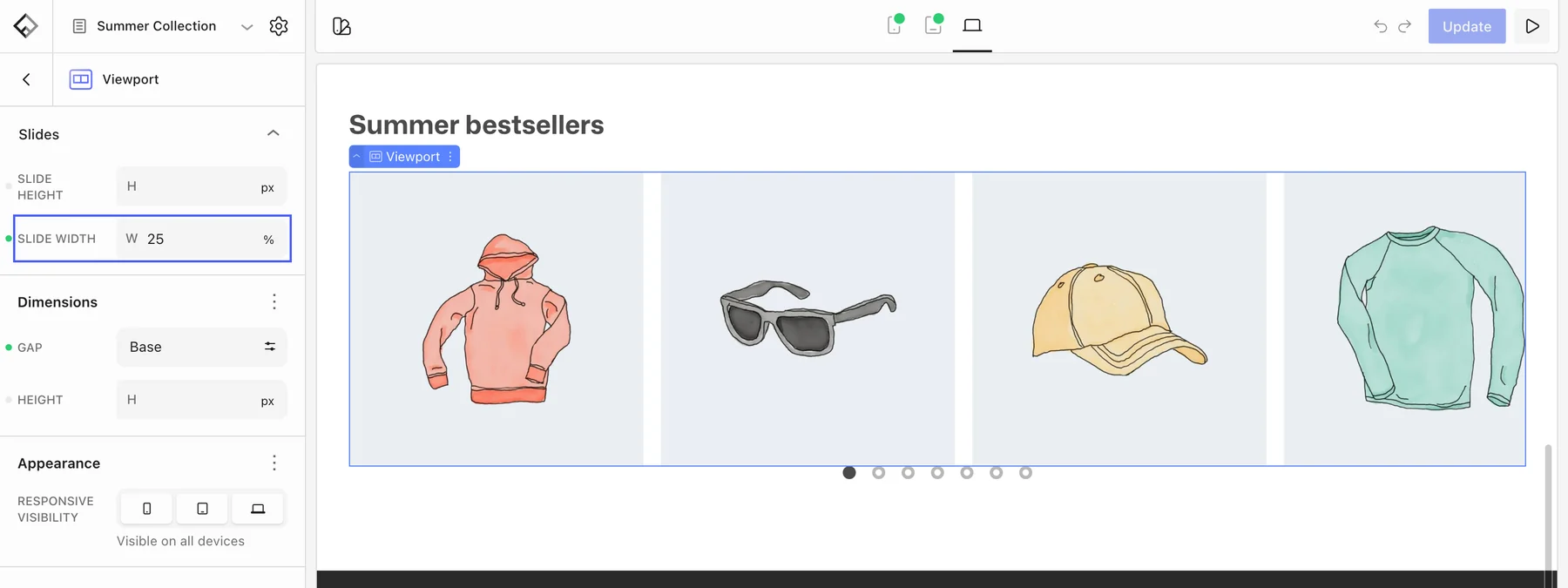
For a carousel, set Slide width on the Viewport, for example 33% on desktop and 80% on phones, and add a Gap. Slide alignment, in the Slide panel of the Slider block, decides whether the active slide sits at the start, center, or end.
Arrows and dots
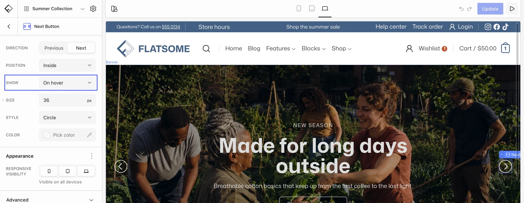
Arrows and dots are blocks inside the slider, so you place and style them yourself. Add two Slider Button blocks with Direction set to Previous and Next, choose a Style (Circle, Simple, or Reveal) and a Position, and set Show to On hover to keep them out of the way. The Dots block works the same way with Circle, Dashes, Simple, or Square styles.
Gallery, Posts, Products, and Instagram blocks have a built-in slider mode with the same arrow and dot options under Layout → Type → Slider, so you do not need a separate Slider block for those.