


Colors are set once in global styles and picked up by every block, so buttons, links, badges, form fields, and sale labels follow your brand without editing each page.
Change the palette
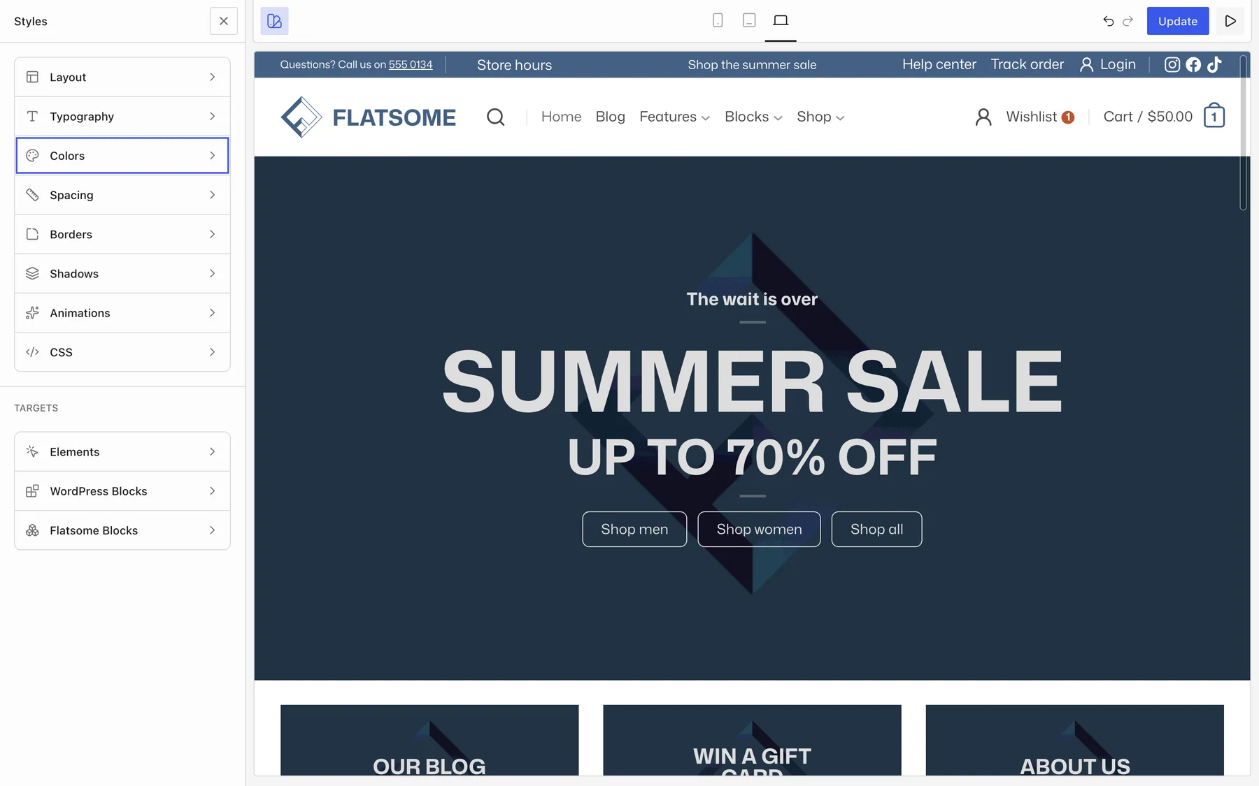
- Open the Builder and choose Styles in the top toolbar, then Colors.
- Under Brand, set Primary and Secondary.
- Under Status, set Success, Warning, and Error for notices and form messages.
- Under Neutrals, set Base (page background), Surface, Muted, Border, and Divider.
- Save.
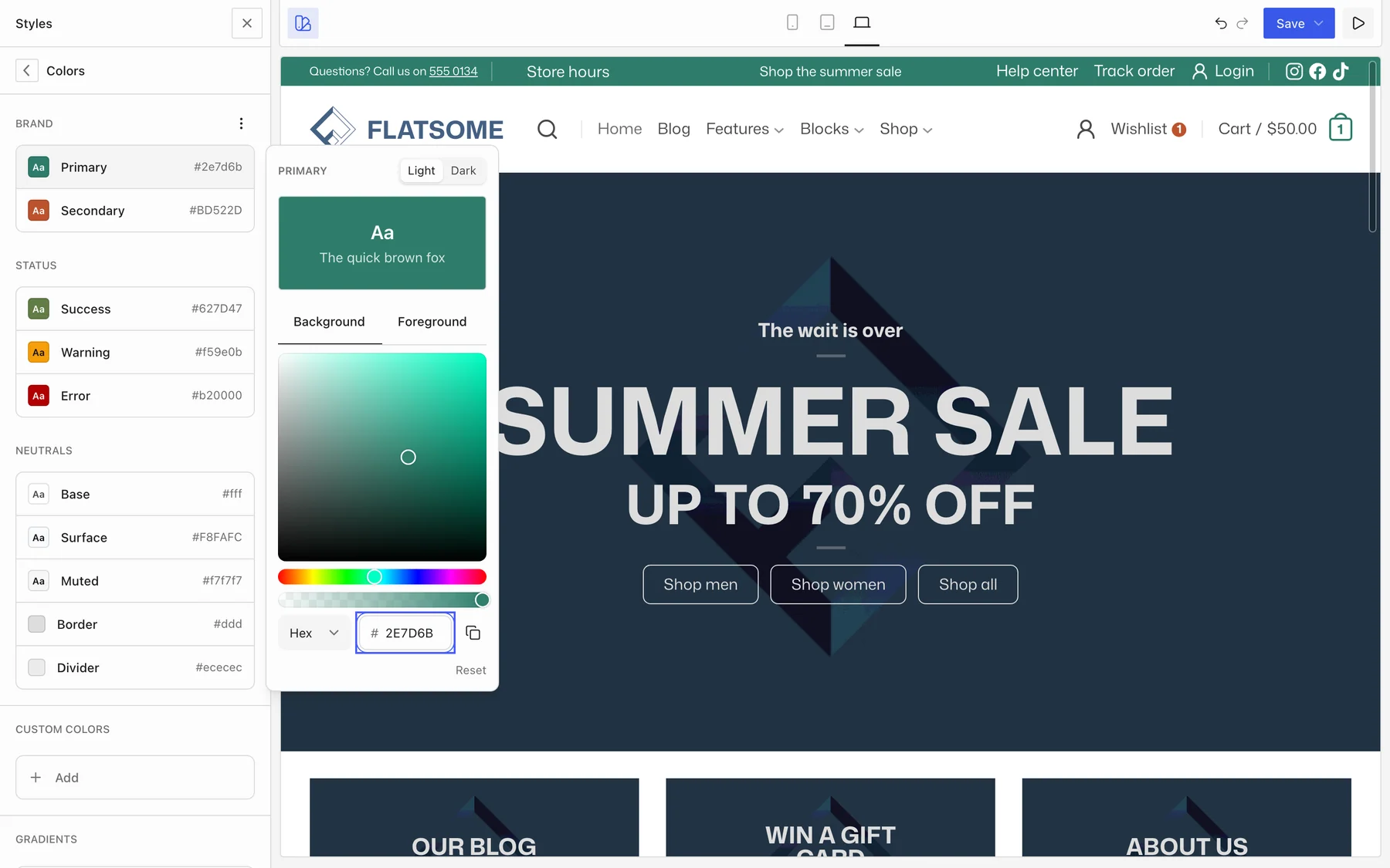
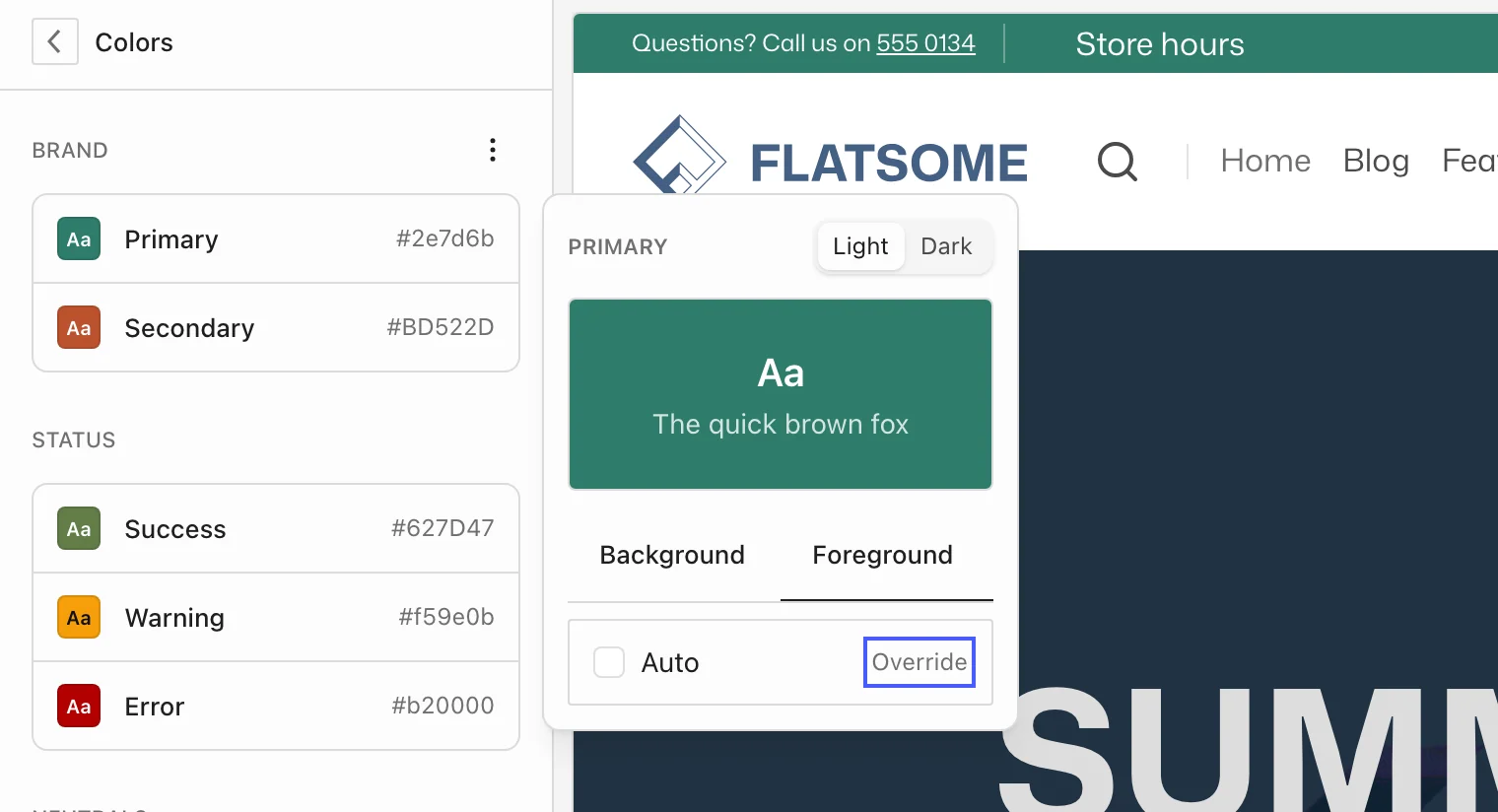
Each color has a matching contrast color for text placed on it. It is calculated automatically; to set it yourself, select a color, open its Foreground tab, and choose Override. Choose Use auto to go back.
What the primary color drives
Buttons, links, focus rings, active menu items, badges, progress bars, icon boxes, form checkboxes and switches, and the accent on the mini cart all use the primary color by default. The secondary color is available on any block for accents such as sale badges and secondary buttons.
Dark mode and custom colors
- Toggle Light and Dark at the top of a color’s editor to set a separate value for dark backgrounds and dark color schemes.
- Custom colors adds extra named colors to the picker, handy for a third brand color that a few blocks use.
- Gradients holds reusable gradients for section and banner backgrounds.
Pick a palette color on a block instead of typing a hex value. That way the block follows the palette when you change it later. The setup wizard sets the primary, secondary, success, and error colors when it imports a demo; everything above can be changed afterwards.