


The header is a template part: one piece of layout shared by every page. It is built from ordinary blocks, so anything you can do on a page (columns, colors, visibility per screen size) you can do in the header.
Open the header
- Open the Flatsome Builder from any page.
- In the editor navigation choose Template Parts → Header.
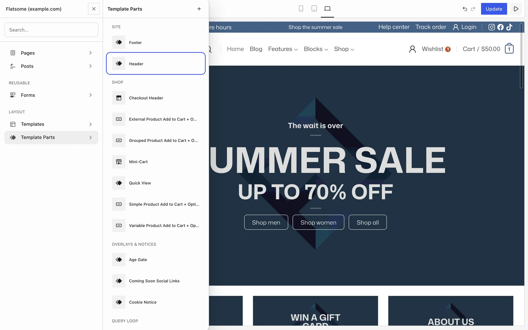
Saving the template part updates the header on every page at once.
Open from the admin bar
When you are logged in and viewing your site, hover Edit with Flatsome Builder in the admin bar and choose Edit Header. The Builder opens with the header ready to edit. In the dashboard, the same admin bar menu has Template Parts → Header instead.
How the header is built
The outer Header block holds horizontal rows. Each row contains Header Columns (typically Left, Center, and Right) and each column holds the actual elements:
- Announcement Bar: a dismissible bar at the very top for promotions.
- Header Row: an extra row, for example a top bar with contact info and social icons.
- Header Main: the main row with the logo. There is one per header.
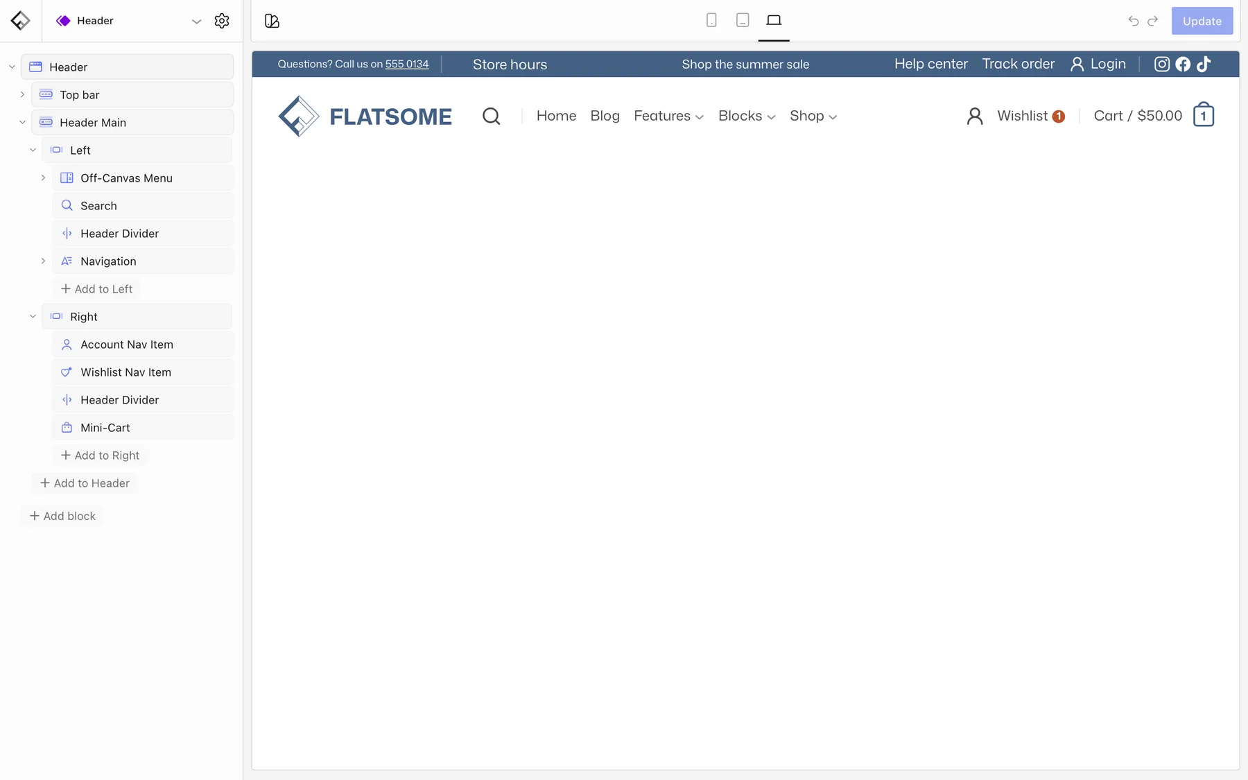
Typical elements inside the columns are Logo, Navigation, Search, Account, Mini-Cart, Wishlist Nav Item, Off-Canvas Menu, Follow Icons, Language Switcher, and Header Divider. Add, remove, and reorder them like any other block. Rows and columns have alignment, padding, background, and color scheme settings, so a dark top bar or a transparent main row is a setting, not custom CSS.
Change the logo
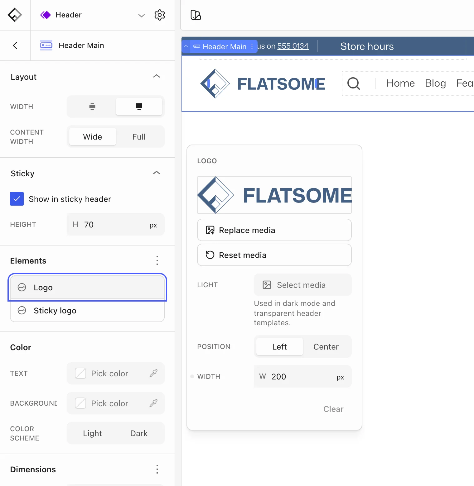
Select the Header Main block and open Elements. The Logo settings hold the logo image, its width, and its position (Left or Center), and Sticky logo sets the logo used when the header is stuck. A light version of the logo can be set for dark color schemes and transparent headers. The Logo block inside the row displays whatever is set here.
Make the header sticky
Select the outer Header block and open Sticky. Choose how the sticky header appears: Slide down, Fade in, or Resize, or set it to Disabled. Turn on Hide header when scrolling down to show the sticky header only while the visitor scrolls up.
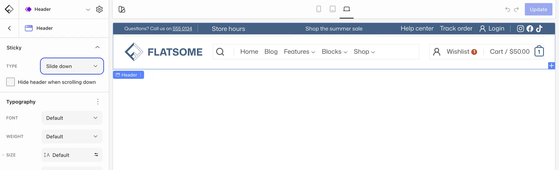
Each row decides whether it is part of the sticky header with its own Show in sticky header setting. Header Main is included by default; top bars and announcement bars usually are not. Header Main also has a separate sticky height, so the header can shrink once it sticks.
Different header on mobile
There is one header for all screen sizes, and blocks are shown or hidden per breakpoint. The default header hides the Navigation, Search, and Header Divider blocks on tablet and phone, and shows an Off-Canvas Menu instead. To change this, select a block and use its Responsive visibility setting in the Appearance panel to hide it at the sizes where it should not appear. See Set up the mobile menu for the off-canvas part.